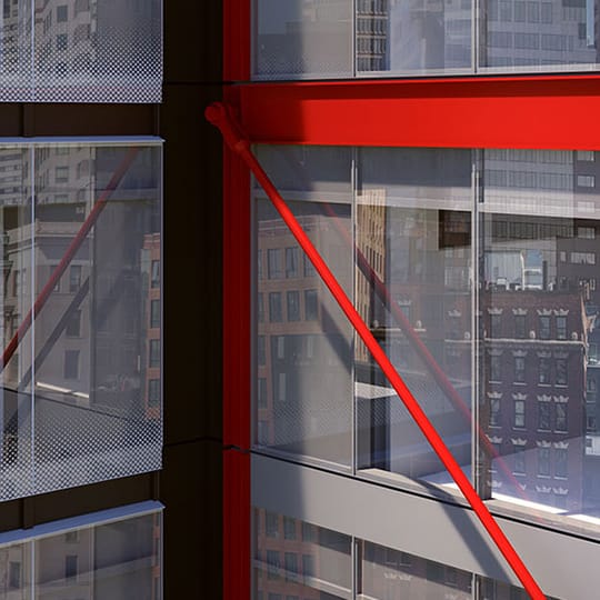
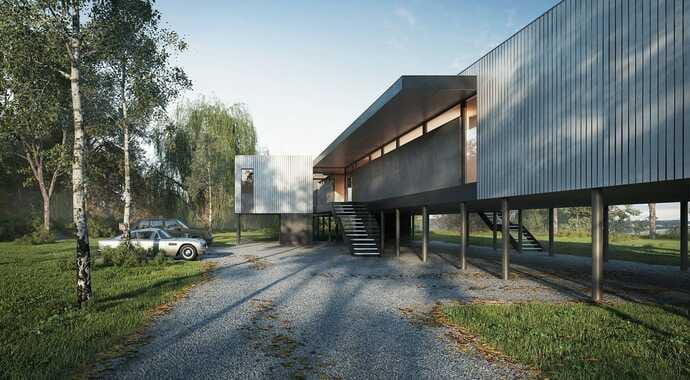
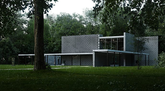
TILTPIXEL reveals how it visualized the modernization of a decades-old architectural structure to meet the demands of modern tenants, with V-Ray and Phoenix FD.
Since we last caught up with TILTPIXEL in 2018, the studio has been keeping busy with many large, high-profile projects, making the last year one of their most exciting yet. The latest project encompassed both architectural renderings and film and required the team to create a number of visual effects, which offered an especially fun challenge and allowed them to stretch artistically. What’s more, a new team member has joined the team and the studio has migrated to V-Ray Next for 3ds Max.
We talk to Ramy Hanna, Partner at TILTPIXEL, for all the latest news from the Houston-based arch-viz studio and find out how the team visualized the modernization of a decades-old architectural structure to meet the demands of today’s tenants, using V-Ray for 3ds Max and Phoenix FD.
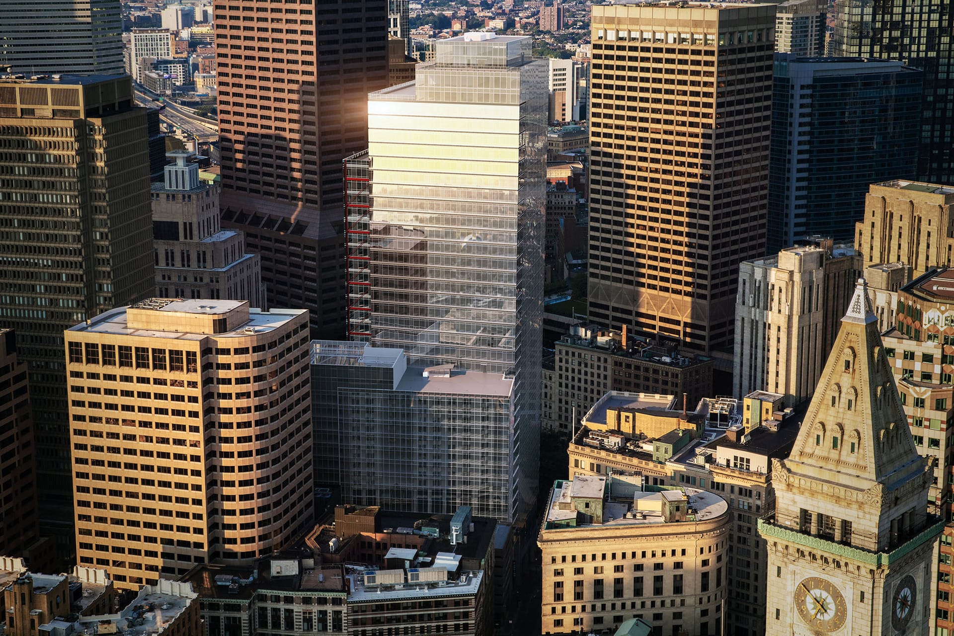
One Post Office Square is a 41-story tower in Boston’s Financial District. This architectural visualization was rendered by TILTPIXEL using V-Ray for 3ds Max.
Can you tell us a little about the brief for your latest video project?
Ramy Hanna: One Post Office Square is a 41-story tower in Boston’s downtown Financial District. It’s a prime location and the building is undergoing a major facelift – recladding the concrete exterior with glass and adding square footage, among other improvements. The idea is to modernize a nearly 40-year old structure for the needs of today’s tenants.
The project itself was a collaboration with LLM Design in Boston, on behalf of JLL and Morgan Stanley. We delivered renderings and a teaser film, with plans for a longer marketing film to follow. LLM delivered a number of services including strategy, branding, a website and interactive brochure, e-blasts, signage and more.
This idea of the old transitioning to new was the driving force behind our initial storyboard with LLM. We had the concept of a central character experiencing a dream that makes way for reality, and we relied on the use of fog as a conduit to transition from the existing structure to the renovated building. The fog is rather abstract, almost mythical, and it ultimately unveils the new tower in the eye of this main character.
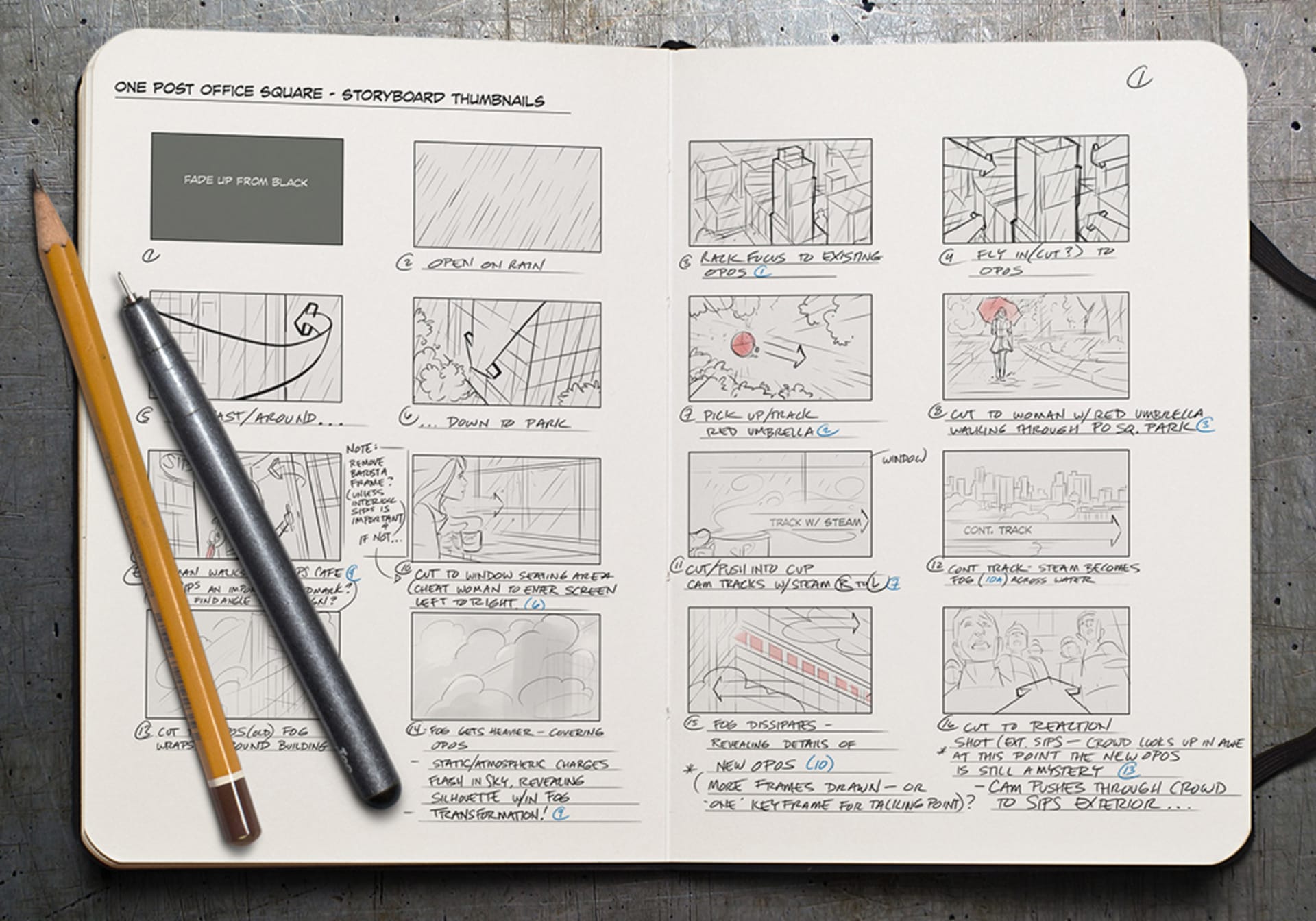
The initial storyboard was based on the concept of a character experiencing a dream that paves a way for reality, and uses fog as a way to transition from an old structure to a new building.
What were the key challenges involved with visualizing this huge renovation project, from both artistic and technical perspectives?
RH: Artistically, we were challenged by the timing of this project. We wanted to promote the renovated building in the best light possible, but the project kicked off when Boston was cold and snowy, and trees and plants were dead. The sky was grey and much of the city was steeped in snow. Because of this, we modeled the Financial District entirely in 3D. By modeling the surrounding buildings, we could control the lighting and weather in ways we couldn’t with photography or video footage.
We planned from the inception that the weather would showcase this building’s transformation. The initial scenes are grey and dreary, with rain and dark clouds. A sunny, much brighter blue sky was then unveiled in conjunction with the revitalized building. Because of this, modeling the region made the most sense from a technical and artistic standpoint.
In addition, we were following the journey of a woman walking through downtown Boston and she witnesses the building emerge while standing in a nearby coffee shop. We tried doing a practical shoot but there were always people in sight and the building itself was covered by scaffolding. We ultimately relied much more on our green-screen shoot and, in some cases, we needed a 3D double because the shots were too wide, or they weren’t working with the perspective we needed. We were very limited in the footage we had and we often wished we had more.
Watch the breakdown of TILTPIXEL’s One Post Office Square architectural visualization video, which follows the journey of a woman walking through Boston.
Our best option was to create the fog in 3D. We needed more control over it. We didn’t want it to roll too fast or too slow, and we didn’t want fog that appeared too breezy or too billowy. With Phoenix FD, we felt we had optimal control.”
Ramy Hanna, Partner, TILTPIXEL
Can you tell us about the storytelling aspect and how Phoenix FD fog was used in this?
RH: We knew from the beginning that we wanted to use fog to reveal the transition from old to new. The footage we had of fog was either too smoky or too wispy and we understood that our best option was to create the fog in 3D. We needed more control over it. We didn’t want it to roll too fast or too slow, and we didn’t want fog that appeared too breezy or too billowy. With Phoenix FD, we felt we had optimal control.
We did a lot of fog tests and learned that by changing the temperature of the fog, we could modify how it reacted around the building. When the fog is hot, it rises, causing the building to appear almost as if it were on fire. We knew the client, for obvious reasons, would not be happy with this! By cooling the temperature, the fog descended in a way similar to mist settling. It was a gentler effect, unlike the menacing fog of our initial attempts. This was the key for us.
Adjusting the temperature to shape the fog’s behavior enabled us to build the effect we wanted.
Phoenix FD was also essential in developing one shot in particular. At a certain point in the film, our actor blows on steam from a cup of coffee. The steam becomes fog which drifts forward and, in the next shot, appears as fog over water. To transition between the two — steam to fog, from coffee shop to water — was challenging. Phoenix FD enabled us to bridge these transitions well.
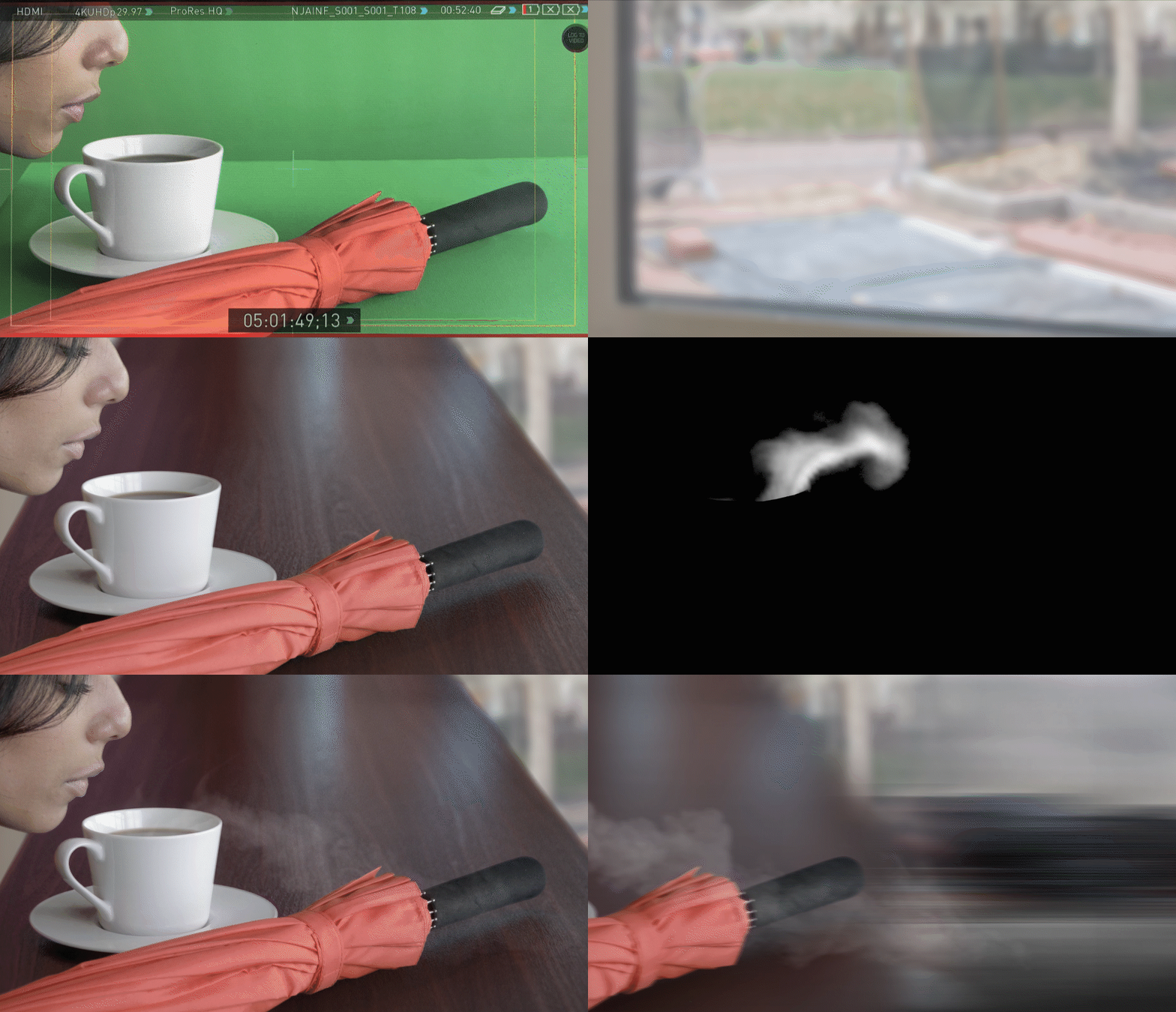
Phoenix FD helped TILTPIXEL create steam that transitions into fog over water in the next shot.
What other 3D creation tools were used for the modeling of the cityscape and can you tell us why they were your tools of choice?
RH: Initially, we did a helicopter shoot for the still 3D renderings. We relied on a third-party photogrammetry software to create a 3D mesh, which allowed us much more control over lighting and timing.
We used 3ds Max, as always, for all of our production. We used V-Ray Next for 3ds Max for all rendering, including the city, backplates, multimattes, atmosphere passes and reflection passes. Adobe After Effects was our go-to for post-production.
Because of V-Ray, rendering is no longer a bottleneck for us. On this film, we achieved render times of around 15 minutes a frame for 1080 HD. The default settings worked really well.”
Ramy Hanna, Partner, TILTPIXEL
When it came to rendering, how did V-Ray step up to the challenge?
RH: Because of V-Ray, rendering is no longer a bottleneck for us. On this film, we achieved render times of around 15 minutes a frame for 1080 HD. The default settings worked really well. At one point, we had five artists rendering at once, and they could all use the default settings with fairly consistent, fast results.
We also had a lot of lights in this film. Since the entire cityscape was built in 3D and part of the film was cloudy, we had to light the entire city. V-Ray handled this well and rendering times were still good.
Translation time was also fast. Even though our scene was over 2 GB, all assets translated quickly so we saved time at every stage.
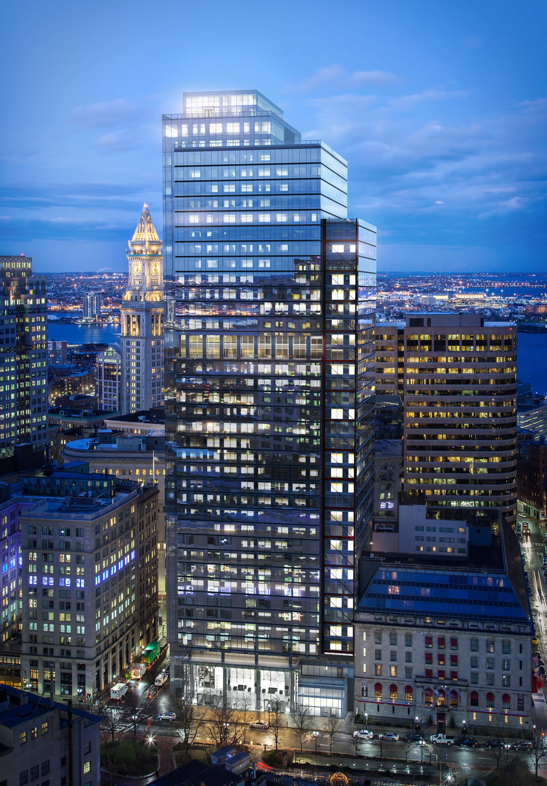
V-Ray was TILTPIXEL’s choice of 3ds Max rendering software for the visualizations of One Post Office Square in Boston.
The default settings deliver solid results every time — there is no more guesswork on the part of the artist, which leads to greater consistency and predictability.
Ramy Hanna, Partner, TILTPIXEL
When it comes to capturing sequences like these, what are your tricks for unique and interesting camera angles and movements?
RH: Just because you can doesn’t mean you should. That’s our philosophy. And it’s very important in a film like this. An artist new to animation is often tempted to try all the tools and effects available. But we view the 3D camera as a real camera and we anticipate how a real camera moves and operates. While we don’t want to limit ourselves, we allow the limitations of a real camera to inform the style and composition of the film. Realism is important for our purposes and mimicking the behavior of a real camera helps us achieve that.
For example, in this film, there are shots where the camera is pointed straight up towards a rainy sky. In actuality, raindrops would collect on a camera’s lens. In a 3D environment, that effect doesn’t happen on its own. We add that as an important element of realism. This is just one example, but it’s something we hold at the forefront of our minds as it drives the style of our finished product.
Can you tell us a little about your philosophy when it comes to using entourage in your arch viz animations and how were you able to push the limits for this particular project?
RH: In this film, we intentionally used only one actor. We wanted her to appear as if she were in her own mind space, without distraction. For that reason, we had a few animated cars but not much else.
For foliage, including trees, plants and leaves, we relied exclusively on V-Ray proxies. In addition, we used Forest Pack as a multi-scattering tool to populate the scene. Our setting for this film included a park and Forest Pack was integral in building the trees and leaves scattered on the ground.
The benefit to proxies and a tool like Forest Pack is to keep the scene light. A smaller, more stable file is important to us.
How is V-Ray Next better than V-Ray 3?
RH:
- V-Ray Next is certainly faster than its predecessor.
- We were on V-Ray 3 for perhaps four or five years; while there were many interesting tools introduced with V-Ray 3, the improved speed and stability of V-Ray Next are the real benefits.
- We would estimate that we have improved rendering speeds by 25%.
- Some of the tools are better optimized with V-Ray Next, so it takes the render settings out of the equation.
- The default settings deliver solid results every time — there is no more guesswork on the part of the artist, which leads to greater consistency and predictability.
- When you match all this with improved speed? It’s a no-brainer for us.
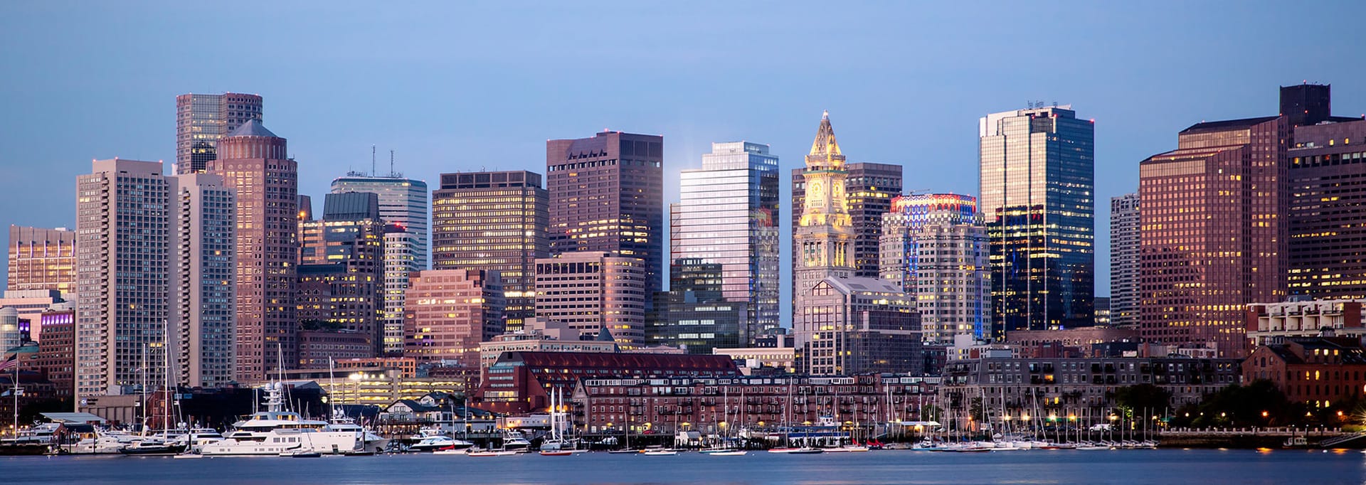
TILTPIXEL estimates the studio has improved rendering speeds by 25% since migrating to V-Ray Next for 3ds Max from version 3.
Learn more about TILTPIXEL and LLM Design.
Are you ready to put V-Ray Next for 3ds Max and Phoenix FD to the test for your own architectural visualizations?
Try V-Ray and Phoenix FD free for 30 days.

