Love Death & Robots’ “Bad Travelling” gave Blur Studio a chance to work alongside legendary director David Fincher. Find out what they learned in the process.
Cinema is often referred to as painting with light — but it could be said that David Fincher’s movies paint with darkness. Beginning with Alien 3, and moving on through Se7en, Fight Club, Zodiac, Mank, and the TV series Mindhunter, the acclaimed director has made use of low-key lighting and anemic palettes to explore the darker recesses of the human mind.
Now, Fincher has taken his characteristic chiaroscuro to “Bad Travelling,” a grisly maritime adventure involving a dishonest, paranoid crew — and a giant crustacean lurking below decks. The Love, Death & Robots episode marks Fincher’s first completely computer-animated short film, as well as his first directorial contribution to the Netflix anthology series he executive produces alongside fellow director Tim Miller.
To create the nautical world of “Bad Travelling,” Fincher teamed up with Blur Studio, the animation and VFX production company founded by Miller. We spoke to Compositing Supervisor Nitant Ashok Karnik and Co-CG Supervisor Jean Baptiste Cambier about working with a living legend of modern cinema, and how V-Ray’s lighting tools helped Fincher embrace the darkness.
Be warned: This article contains spoilers for “Bad Travelling.” Read on at your peril.
What led to Blur working on Bad Travelling?
Nitant Ashok Karnik: Neal Asher’s “Bad Travelling” has been high on the list of short stories to adapt since David and Tim first developed it for Heavy Metal. Blur has collaborated with David Fincher on Girl With the Dragon Tattoo and Mindhunter in the past, so it made sense for Blur to work on it based on the trust we’ve built together.
Personally, I really enjoy stories with moral dilemmas and complicated antiheroes, so I was drawn to it from the beginning. There was no f*****g way we were going to let any other studio work on it!
Jean Baptiste Cambier: Since the beginning of the series, Tim Miller, David Fincher, and Blur have considered a ton of novels, short stories, and original ideas to adapt for the screen. Most of those stories are still waiting to be told and can potentially be part of future productions. David Fincher read “Bad Travelling” 15 years ago, and I guess the idea never really left his mind. As Nitant mentioned, it was just the right time and place to do it.
How did you feel when you found out you’d be working with David Fincher?
NAK: Honestly, disbelief! Like many, I’m captivated by David’s films and breadth of work. The way he builds characters and puts scenes together blows my mind. Saying he’s one of my favorite directors is an understatement.
When I found out I was going to be Comp Supe on this show, I was beyond ecstatic. But I also had that “oh s**t” moment where I knew I needed to give everything I had to this project. I really geek out on storytelling and podcasts such as “Team Deakins,” so working with a director I respect so much was one of my life goals.
JBC: Exactly! A lot of us grew up watching his movies and have been transported by his stories. In many ways, knowing that we would be collaborating with him on such a piece also made us realize that we could use our particular expertise and sensibilities in animation to tell his story.
I have to say, it was intimidating at first, but David brings you with him on the journey, which rapidly transformed us from admirers to collaborators. Since this short film is his first animation project, Fincher was naturally curious and open to exploring the medium in new ways. But my main reaction was simply: “Hell yeah! When do we start!?”
Fincher’s best known for live-action work. How did he adjust to animation? What was he like to work with?
NAK: This is going to make me sound like a total fanboy, but there were several times when I wondered if David is a genius. He’s keenly aware of the practicality of different textures, surfaces, and materials, and the physics of how they react to light in the real world. But he’s also laser-focused on story. Character building, conveying mood, creating scenes, and depicting lighting are all in service to superb storytelling.
It was so great working with him, and I learned so much. David trusted the Blur team to collaborate on the key objective: to deliver on the story. And so he left much of the minutia and trivial stuff alone. That doesn’t always happen in our industry, so it was really refreshing to deliver on this vision. David always articulates exactly what he wants, and that clarity motivated our team to deliver our best work.
Even though this was David's first animated show, he wasn’t fazed. Since storytelling is still the core, it was just a matter of understanding certain on-set terms David would use that we’re not familiar with as artists in our dark rooms. We’d ask what he meant by muzzball or Fisher Light in his feedback notes, so it was fun to learn and add to our lexicon.
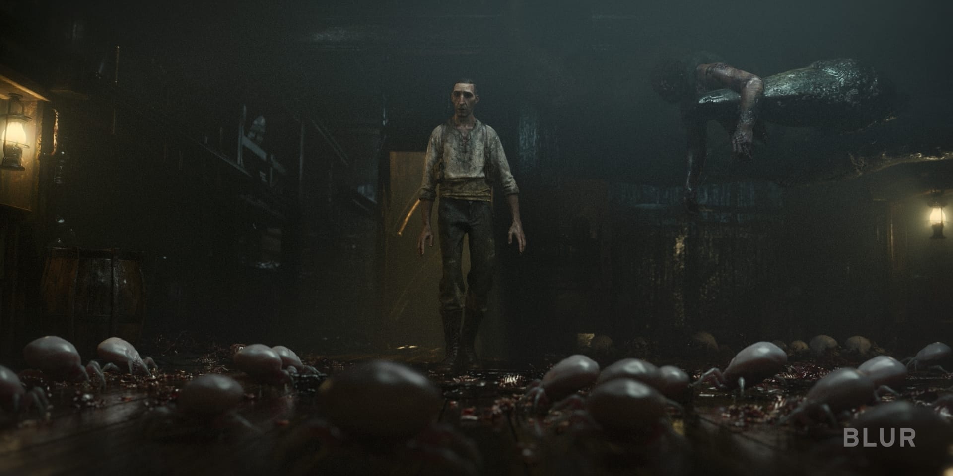
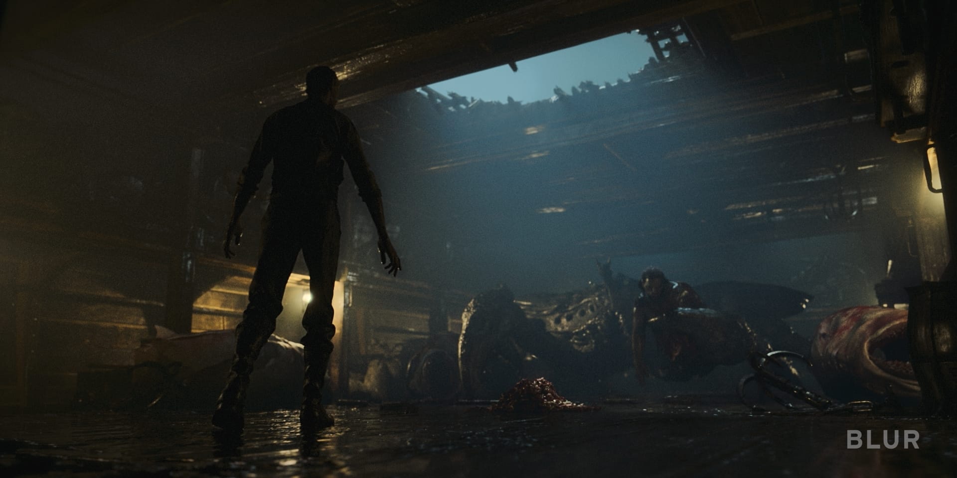
One of my favorite observations from working with David is how his eye for color is insanely precise. For example, when we were establishing lighting for the Bloodhawk ship’s cargo hold, David specified that he only wanted oil lanterns and moonlight – specifically 1,800K and 4,000K respectively. And of course, they were all spot-on in look and feel. I marveled at how knowledgeable he was on everything. We’d all be furiously Googling to understand exactly what he meant.
JBC: David is used to working with visual effects teams on his movies and we managed to establish a trusting relationship with him very early on.
Some aspects of an animation pipeline offered him a new vision of his own work too. For instance, during his work with the layout team, led by Aaron Weldon, at the early stages, some cameras were set up in order to see the whole action from above in an almost orthographic view. This allowed David and the artists to set up the action as a whole before determining the camera angles. Another obvious point was to be able to refine a performance to get the most out of the story.
Animation, as opposed to live-action, has a major drawback: it does not often leave much room for on-set happy accidents or instinctive decisions as everything is thought about, planned, and calculated. So we tried to leave room for those happy mistakes, by only lighting and crafting a few key shots, and then running all the shots of a sequence, even if they had a large number of shots in them.
By rendering sequences this way at an early stage, we sometimes got a more intuitive result, and the shots didn’t look overworked, or we found lighting setups we would not have otherwise got. This was part of our way to regain something more instinctive and natural in our lighting approach.
What was your scope of work on Bad Traveling?
NAK: As the compositing supervisor on the show, I was dedicated to setup, lookdev, and final delivery, so I was there from start to finish. This is a bit unusual, but we intentionally set this up differently than the typical VFX live-action show. We only had six months to deliver 386 shots and I had a team of five compositors. It felt overwhelming at first, but those limitations just meant I had to be very selective and strategic about where and how the compositing team was involved. We optimized our workflow with the lighters from the start to make sure we didn’t need to support every shot.
JBC: All the teams worked very closely together. On my end, I was co-CG supervisor with Colin James and I worked hand-in-hand with Nitant to drive the teams through a show that took almost a year to make. This show was “all hands on deck” — pun intended! I ended up doing some lookdev for a few sequences, lighting shots, and compositing shots as well.
Fincher and V-Ray
David Fincher’s relationship with V-Ray goes way back. In 2005, he collaborated with VFX studio Digital Domain to produce the official music video for “Only” by Nine Inch Nails. The promo marked the first time V-Ray’s photorealistic ray tracing was used in a commercial project, and its all-CG nature allowed David to strap virtual cameras to a Newton’s cradle, cram them into a MacBook’s speakers — and turn lead singer Trent Reznor into an animated pinscreen.
Could you tell us about the lookdev process?
JBC: It’s important to clarify that, at Blur, lookdev represents the building of the look of a sequence. Other studios may use this terminology to describe the making of assets such as characters or environments.
Neither Nitant nor I had built assets on “Bad Travelling,” though we have done a lot of back-and-forth with the character modeling team and the environment team while creating sequence lookdevs for the project.
NAK: I really enjoyed the lookdev work on this show. I mentioned that David was very intentional and articulate with exactly how he wanted the audience to feel during scenes.
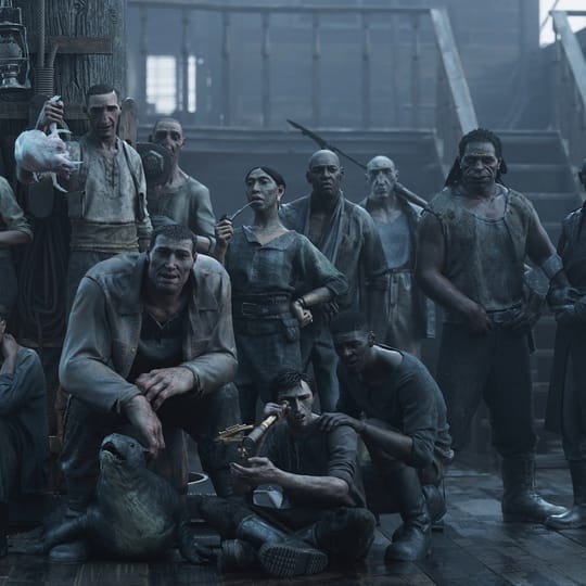
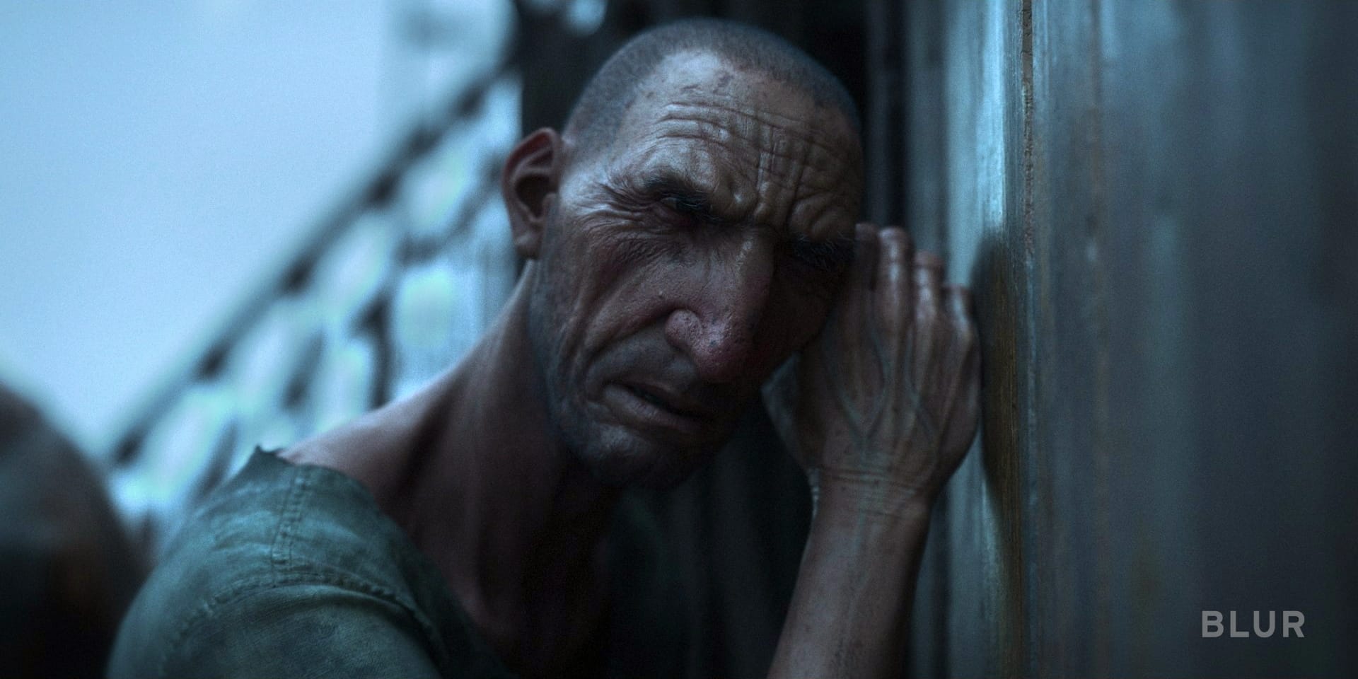
For example, David wanted the ship deck to feel disgusting, like the worst place you’ve ever been. That is, until you go below deck and experience the hellish, dank, dark cargo hold where the Thanopod creature resides. We worked hard to make these characters feel like they were in a horrible, wretched place, and to make the audience feel as uncomfortable as the characters looked.
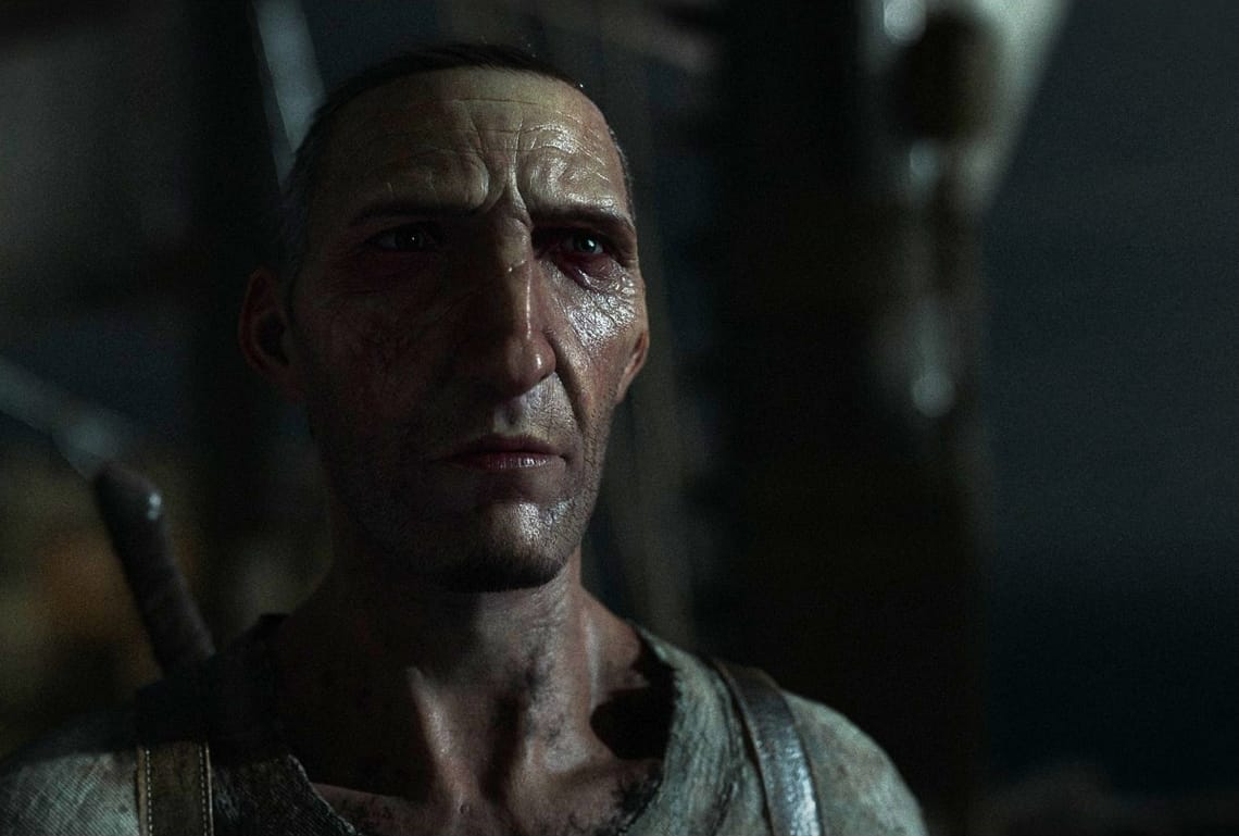
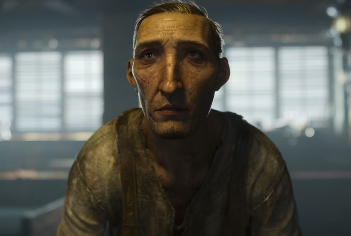
We played with lighting on the characters. For the antihero, Torrin, our art director had the idea of using a 50/50 lighting style, where only half his face was lit. Conceptually, we thought this lighting mirrored how morally gray his behavior was. You can see this transition from the beginning of the short, where the light wraps across Torrin’s face, to the end where he’s murdered his entire crew and his face is half-lit.


JBC: Early on, the lookdev process starts with our art director Alexey Andreev. His first steps are to gather an initial deck of references from various places: movies, paintings, and concepts. Then he proceeds to paint directly on some keyframes of our layout.
Colin, Nitant, Alexey, and I knew from the start that we wanted to make the show particularly dark. The story is dark, our characters are under constant pressure, and we wanted to embrace the story with the mood. Our amazing lighting leads Jared Tripp, Chris Fung, and Sebastien Chort went all-in for it and led their teams to produce such a wonderful look.
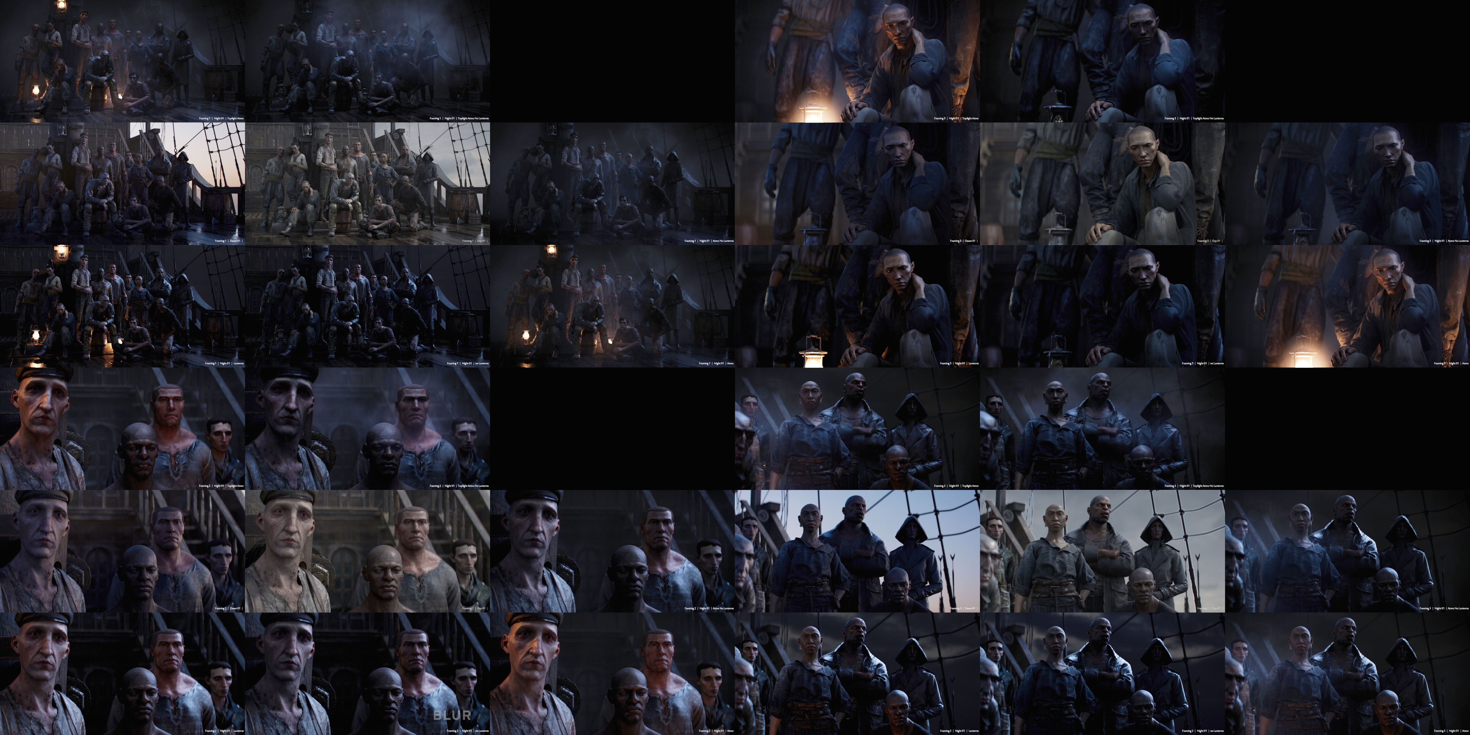
After the visual development deck was built by Alexey and Jerome Denjean, and after we got on the same page on our intentions, we created a still frame of the whole crew standing on the deck of the boat, which helped us start look discussions with David.
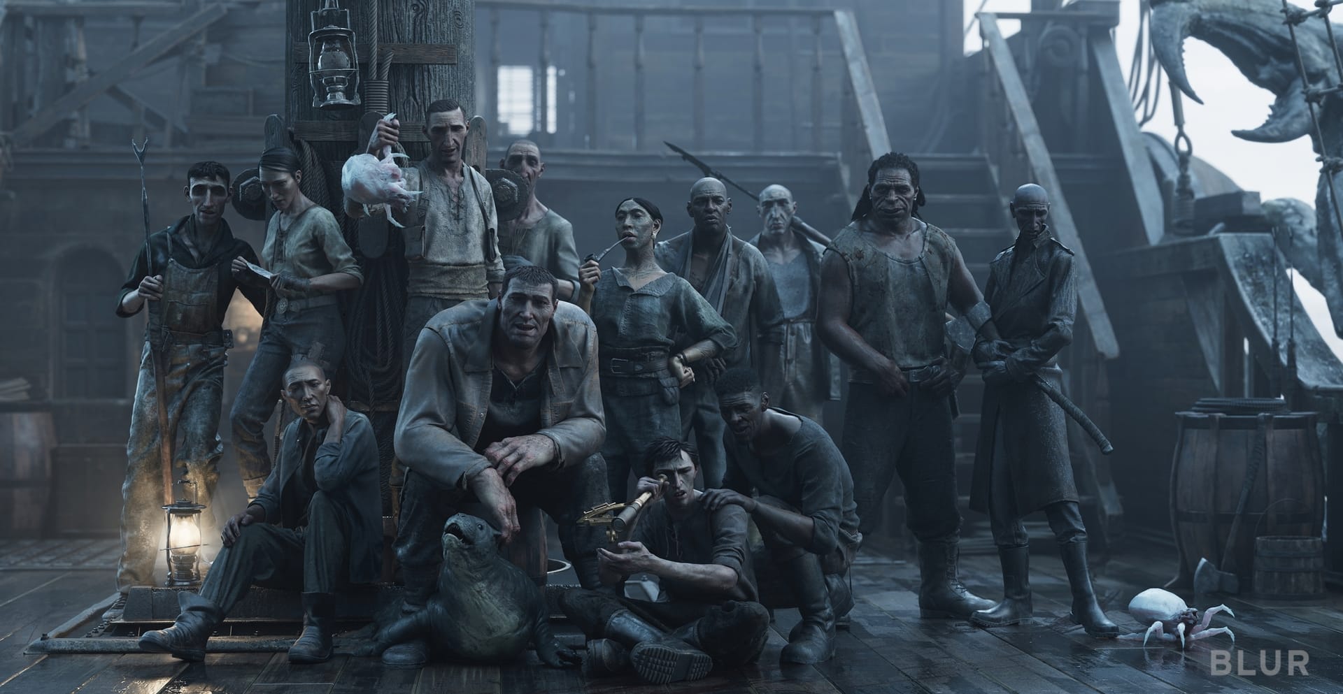
From this starting point, we threw in a lot of versions of the same frame under different lighting scenarios and colors. We then got to meet David and showed him that contact sheet. He loved it, and it triggered a very long discussion about what the show should be.
"Bad Travelling" has a very cinematic feel. Where did you look for inspiration?
For this project, our team mostly referenced films that embraced darkness and horror. We also like to reference the strong use of practical lights, so we spent a lot of time digging into films such as The Witch, Funny Games, No Country for Old Men, The Revenant, and The Black Stallion. Our art director also took cues from paintings by Rembrandt and Ilya Repin because of the interesting and unique ways lighting shaped their faces and bodies. There was a lot of that in our show.
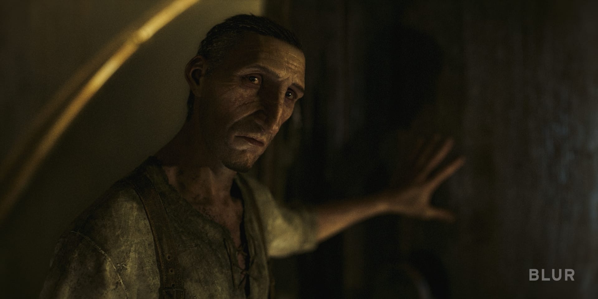
JBC: We always try to embrace the story with the look. For instance, in the sequence where Torrin, the protagonist and captain of the Bloodhawk, gets attacked in his sleep, we wanted some kind of visual clash. Something grave is happening: the crew decides to kill their captain.
We start the sequence in the captain's quarters, very softly lit by a candle and the moonlight coming through the door and the windows. You'll notice that as the crew snuffs out the candle and progresses towards the bed, the light coming from the moon through the blinds becomes sharper and all warmth disappears, leaving colder, more aggressive lighting. The show is full of these little details that contribute to carrying the spectator through the story.
Another example that explains how lighting can highlight a character trait, is when Torrin abruptly makes his point about sticking to the plan (which leads the crew to decide to kill him). He then turns to one crew member next to the mast. In reaction to Torrin’s aggressivity, the character leans back. He is more discreet than other crew members and avoids confrontation. We simply took full advantage of the mast next to him, rotated our light, and added blockers in this shot to make sure that, as he leans backward, he also falls into shadow. The look accentuates a character trait.
In addition to solid camera angles and framing, set dressing can help reveal or hide part of the action or the story, and it has a lot of power over the characters. Sometimes it can be as simple as lowering the ceiling to put more pressure on a protagonist. We also place props and parts of the environment to cut out sharp shapes through the atmosphere and tell the viewer that danger is coming or to build or release tension.

