Discover how MTMA uses Chaos Vantage to enhance its designs and create immersive, photorealistic architectural spaces in real-time.
MTMA is an Italian studio specializing in archviz, using cutting-edge techniques to create realistic images and animations of architectural spaces. Founded by Marcello Pagnan, Marco Bozzetto, and Tommaso Gasparini , MTMA has extensive experience in the architecture industry and has worked with major architecture firms in Italy and abroad. To successfully bring their architectural projects to life, they rely on Chaos Vantage, a software tool that allows real-time exploration and presentation of 3D scenes.
Keep reading to explore MTMA's work, their visualization techniques, and how integrating Chaos Vantage into their workflow has helped them create immersive experiences.
Can you tell us a bit about your journey in 3D?
I’ve been using 3D technology since I graduated in architecture in Venice (2003) to communicate my ideas. At that time, I rendered using Autocad, and my friends were amazed by the results that I could achieve. Then I switched to 3ds Max and its internal render engine, and finally, I began using V-Ray for its great Global Illumination management.
What led you to open MTMA studio?
I met my future partners while studying. We all had work experiences in different architecture firms, then in 2008, we decided to open our own firm, combining design and presentation skills. Mutual trust developed over a long period of time, recognizing each other's alternative approaches and complementary skills, has guided us toward success.
What are the core stylistic principles that define your work?
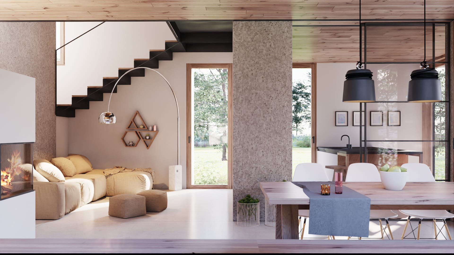
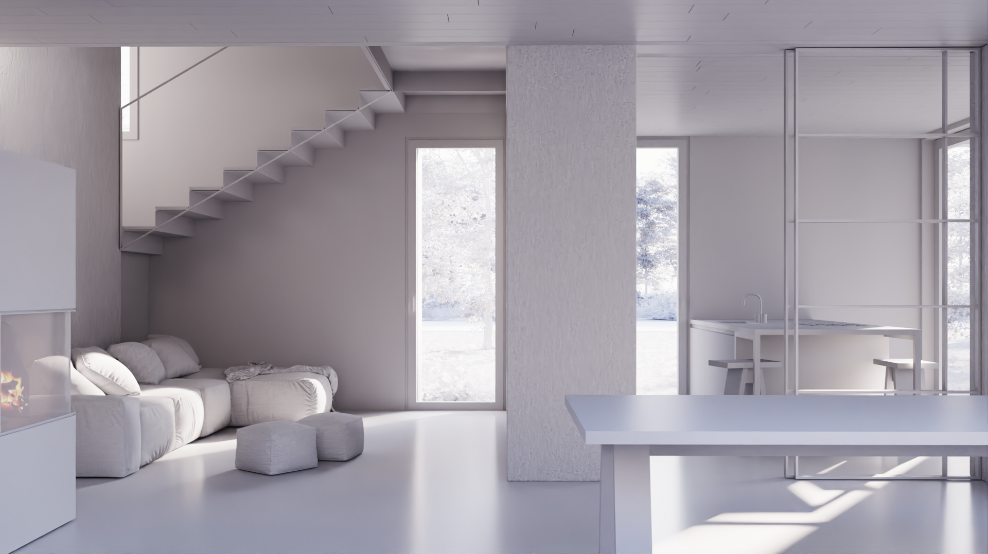
It really depends on the final goal or purpose of the project. For our internal architectural projects, we widely use the “clay render” technique to check our ideas and then communicate them to our clients. It’s a great time-saving tool. We usually create these images in VR, so our clients can understand real-life spatial proportions. We often stop at this stage because our focus is not on the furniture but on architectural volumes and how natural light interacts with them. Meanwhile, if the job is for other architects, we switch to more detailed and complex scenes based on their mood boards.
In the case of architecture competitions, we try to mix realism with a stylized mood because we have to convey our ideas to a mixed audience made of technicians and designers.
You are an early adopter of Vantage. How has it changed your workflow in the last few months?
A greater amount of creativity in less time. We were used to investing huge resources in upgrading or changing hardware, and still, we had to rely on rendering farms in case of animations or large images. We are Vantage early adopters since it was in beta testing, aka Project Lavina. At that time, we were testing it with an Nvidia RTX 2070S.
When Chaos Vantage was released in its final commercial version, we installed RTX 3090 on our workstations. We finally had no more limitations! We were able to work on huge scenes with millions of instanced objects, so foliage, trees, and grass could be edited on-the-fly with real-time feedback. Even the final images (6000x6000) take 2-3 minutes to render! Before Vantage, we used to batch render them, typically needing a full night to calculate, and we would hope for no errors or blackouts.


What is the most important thing to keep in mind when telling a story with images?
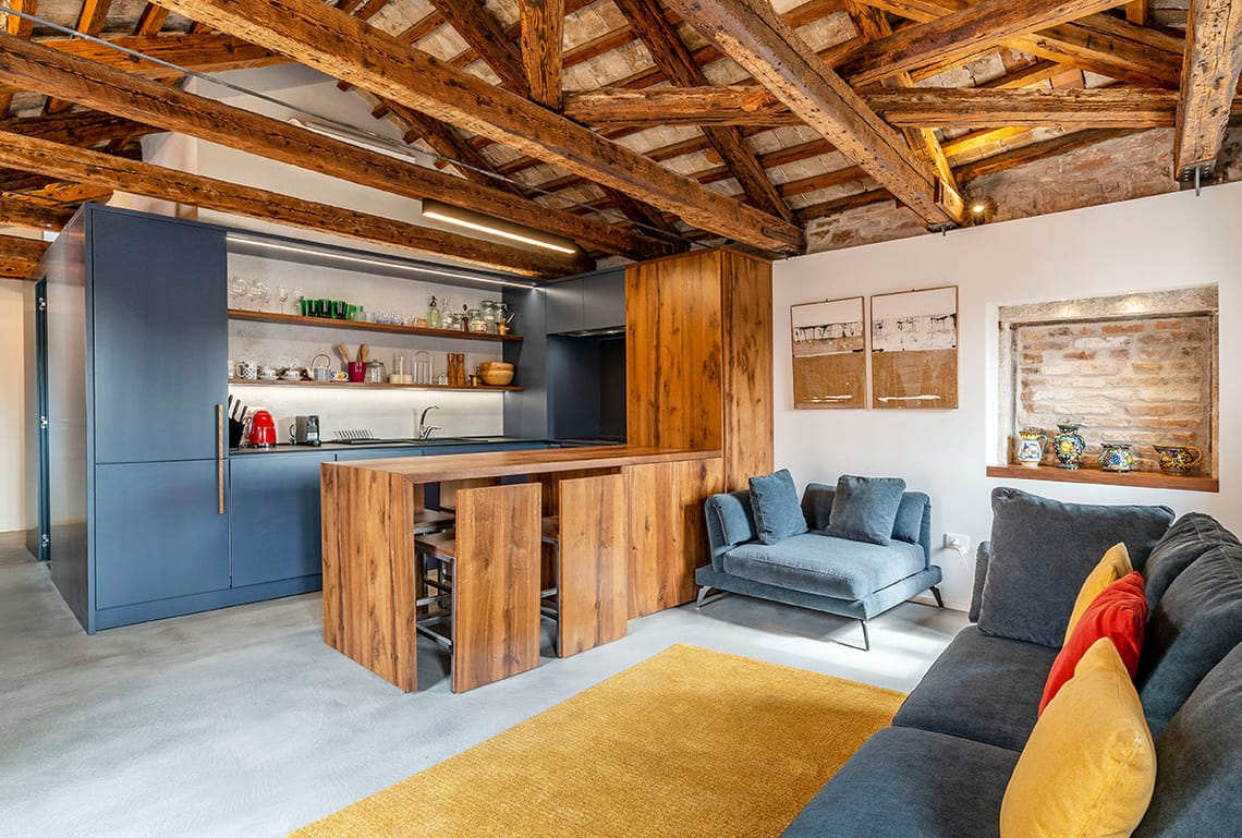
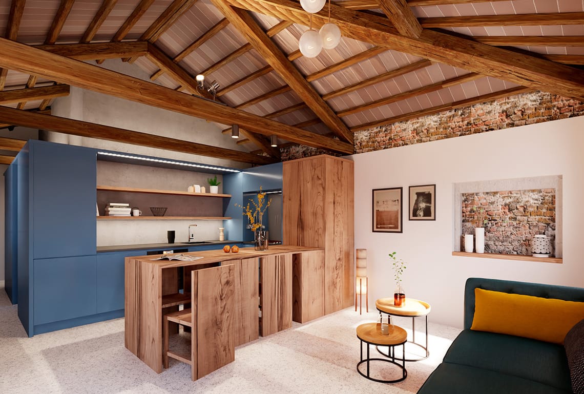
We must remember that even if CG is getting better and better and sometimes looks like a photo, there are many variables to consider. From money and time limitations to the media, we are going to use to look at the image – paper, monitor, smartphone, etc.), lighting conditions, etc. In our daily work, we must explain our vision of the project to our clients, and CG images are just a piece of a very complex and fascinating puzzle.
The final image may intentionally avoid photorealism: it should be able to express ideas and concepts, suggestions, and perhaps even emotions. Realism is often what the client expects, but it can become a limitation when it is excessive and when the viewer can’t understand the architectural language.
There is so much movement and life in The City of Water project. Can you tell us the story behind the installation?
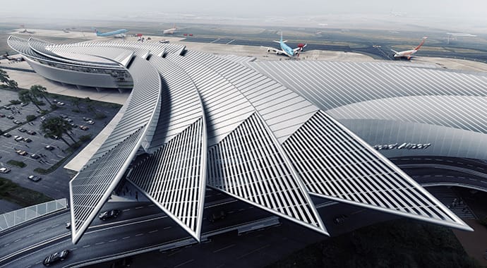
The continuous climate change reminds us of the value and preciousness of water. The project aims to regenerate urban spaces starting with the enhancement of watercourses (whether existing or disappeared, open or hidden) that cross the city. Water is a vital element, fluid, in constant motion, and intrinsically capable of adapting to the places it flows through. This theme has translated into proposals for urban spaces regenerated through water, therefore green and vital, hospitable and serene.
Can you tell us how you produced the lighting in the outpatient clinic project?
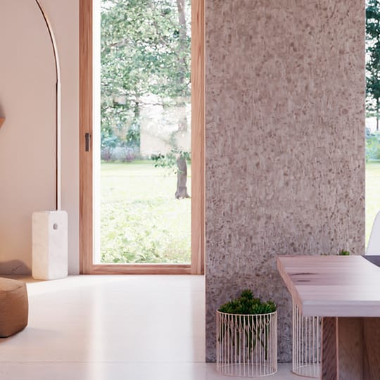
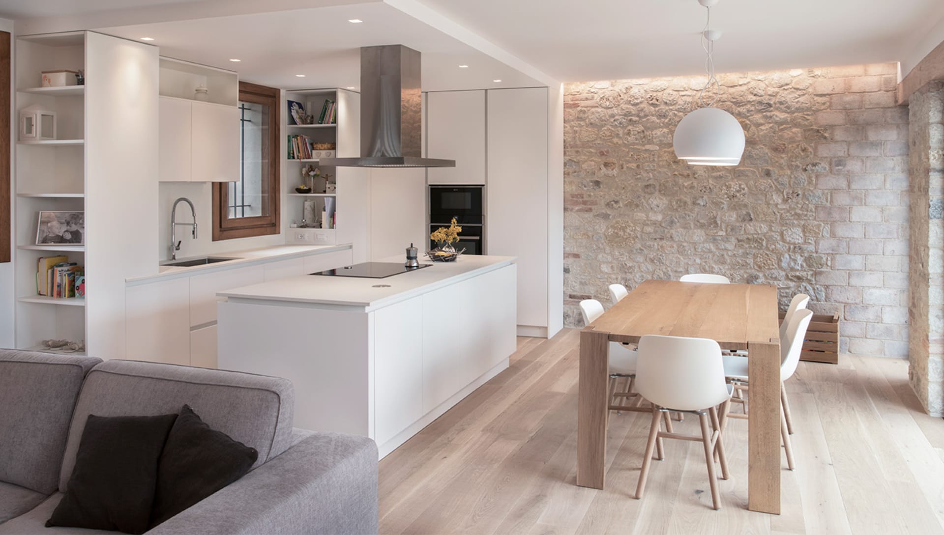
To design the lighting, we looked for a simple yet modular and complete system that could be adapted differently in the various spaces of the medical center. This was done to ensure the correct lighting comfort in each environment while also trying to give the project a unitary character through the lighting system. Health and "candor" go quite well together, and an almost monochromatic project, almost entirely white, offers different surfaces to be illuminated and enhanced with tendentially indirect light, abundant but never annoying.
How about the layout and composition? Did you spend time talking with the clinic staff and what was essential for them to do in the space?
The project was commissioned by a highly experienced pharmacist who is concerned about both doctors and patients. He was able to envision a well-articulated and comprehensive service, requiring highly professional and well-equipped environments but also welcoming and relaxing ones.
Initially, he conveyed to us the specific needs of the various planned clinics, including some specialized ones. Once the various doctors who would be working in the facility were identified, he organized some direct personal meetings. Listening to the medical staff was really important. However, the client went beyond that, asking us to pay attention to motivate the doctors to work in harmony and with team spirit.
Besides the clinics, the medical staff has access to a break room which is equipped with a small kitchen. For patients, in addition to a bright and comfortable waiting area, there is direct access from the parking lot, designed to facilitate the elderly and disabled by entering from the outside planted terrace.
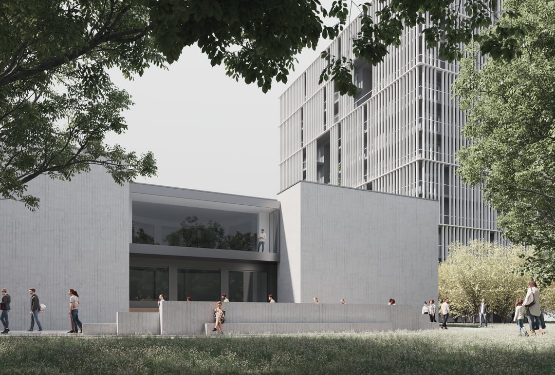
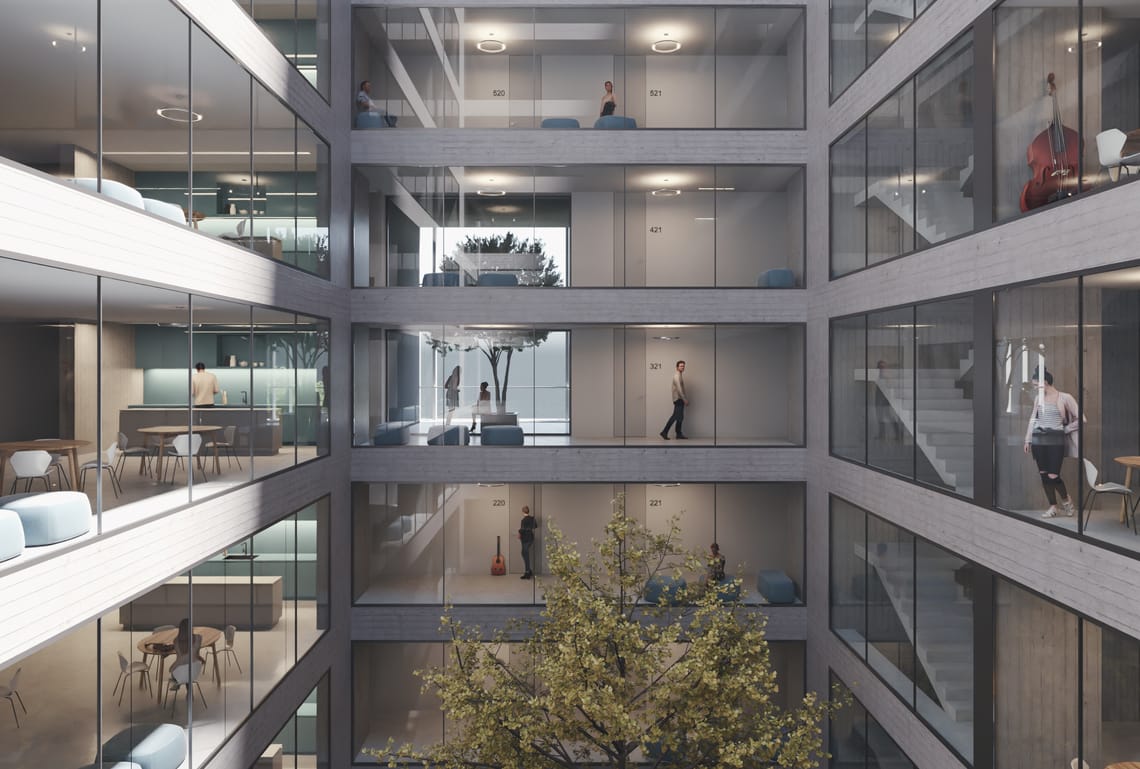


You were awarded a prize for your outstanding achievement on Bosco della Musica. Could you please tell us a bit more about this project?
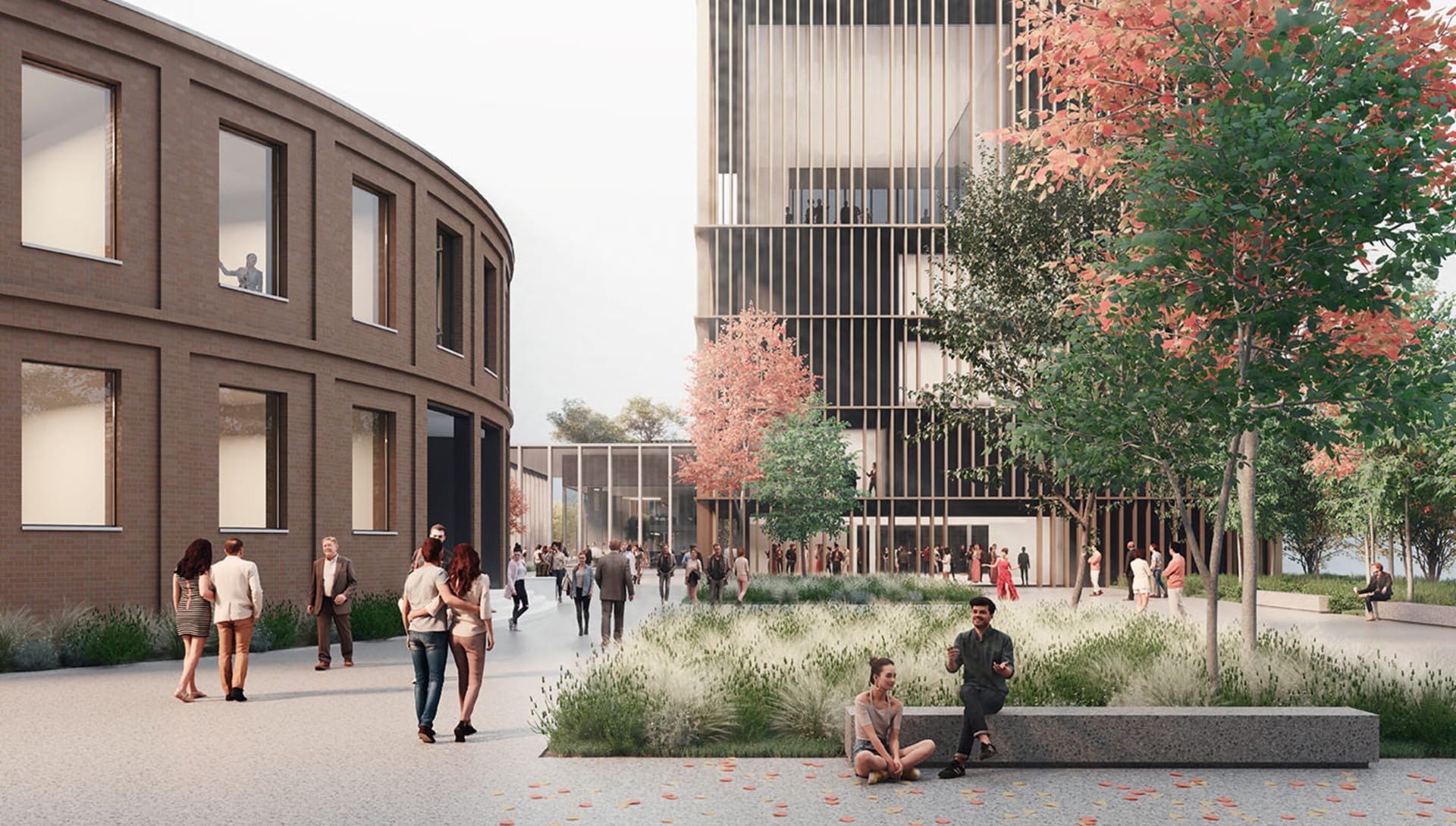
We entered this international competition that asked us to design a brand new site dedicated to the music conservatory of Milan. A project aimed at regenerating a degraded urban area by combining music and greenery in a space open to the city and accessible to all citizens.
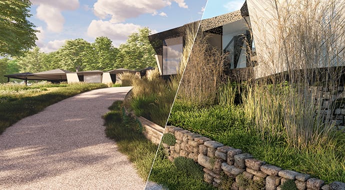
It is the most important competition we have been involved in so far, and at the time of entry, we were concerned we could have worked out the project. There were many critical architectural firms involved, and being awarded fourth place was a huge achievement for us. We must say this competition was the reason we finally introduced Vantage in our working pipeline: five main buildings surrounded by all kinds of greenery (trees, bushes, grass, etc.), scattered people, external and internal shots, and many different lighting conditions. It would have been impossible to complete all the images with the classic offline rendering technique.
What projects can we expect from you in the future?
We are conducting research and investing in the field of public works, both through direct assignments and international architecture competitions. Although residential architecture is an essential field of our profession, we feel the need to address more complex issues that involve living as an interweaving of needs at various levels, from the aesthetic to the social.

