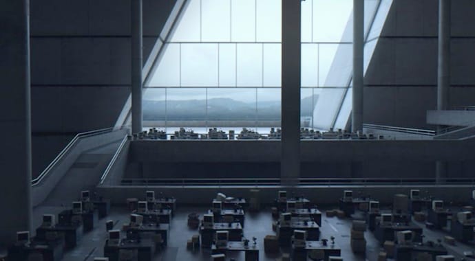
Beauty and the Bit’s enchanting short-film “The Sound of Ink” tells the story of a library through the eyes of a director. Learn tips to help you recreate it.
Beauty and the Bit are no newcomers when it comes to making a statement in arch-viz. The architectural communication studio breaks tradition by creating compelling stories through movies. You probably heard about them when we featured their movie "Landmark" on our blog. And just last week, founder Victor Bonafonte was a guest on CG Garage episode #351.
This blog post is a brief overview of Beauty and the Bit’s latest cinematic project "The Sound of Ink," presented during this year’s 24 Hours of Chaos. Watch the video below and immerse yourself in the architectural experience, or keep reading to learn eight tips you can follow to achieve the visual narrative created in "The Sound of Ink".
How it all started
All great projects begin with a clear and concise vision. For Beauty and the Bit’s CEO, Victor Bonafonte, his dream was to blur the line between architecture and cinema. So when the opportunity arose to work alongside strategic partner Schmidt Hammer Lassen Architects on the visualization of a modern library in Shanghai, he brought his team together and shared his vision.
If you would like to make an architectural film, be prepared to do something cool. We would need to agree that it should be something more artistic than the typical descriptive architectural film.
Victor Bonafonte, CEO, Beauty and the Bit
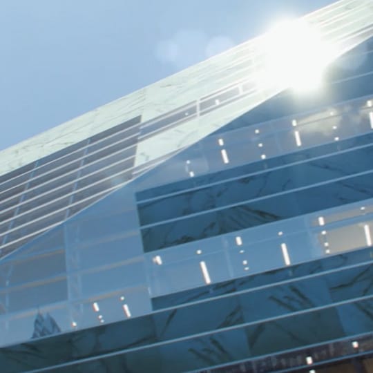
And in the end, that’s what happened with "The Sound of Ink". Victor describes the project as, “working on our second house.” The client wanted a short movie featuring the atmosphere of Shanghai Library East, but what Beauty and the Bit provided was a captivating story, winning them the competitive bid. The short film captures the moment before the doors are opened for the first time.
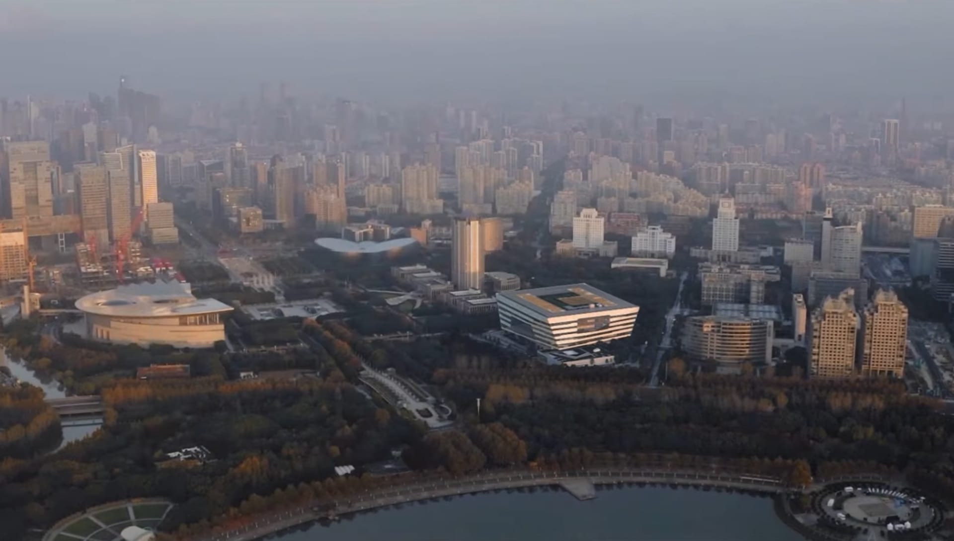
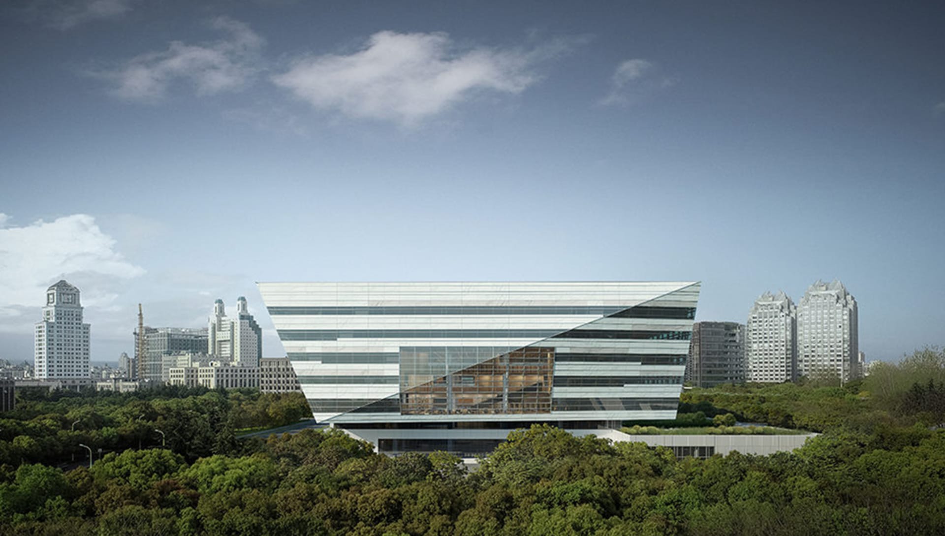
The building is situated in Shanghai’s bustling business district Pudong overlooking the city’s 8000 square meter Century Park. Construction is planned to be complete by the end of this year.
We decided to break down the studio’s approach to creating the story in the form of helpful tips from Victor himself on how to make an architectural film come alive. Curious to get a behind the scenes look of The Sound of Ink? Check out the video below.
Tip 1: Break conventions
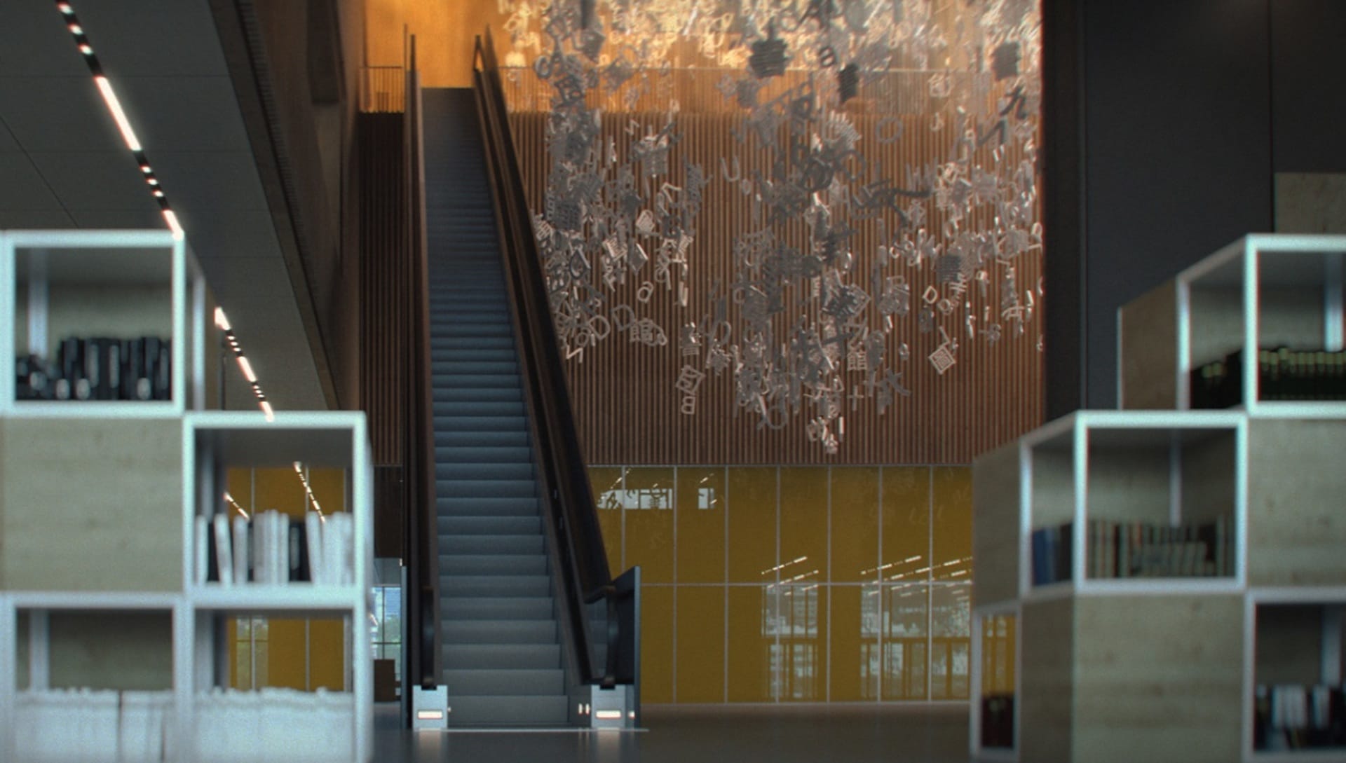
In order to stand out, you’ve got to break the rules. For Beauty and the Bit, it meant telling the story of the library through the eyes of a photographer or director instead of a hurried passerby. The studio spent the most time in this initial stage, trying to refine viewport captures to create a strong narrative from a cinematographic point of view. Of course, the music is important as well and should be kept in mind throughout the entire creation process, as it is the thread that ties everything together. Once this initial step is complete, 70% of the work is done.
Tip 2: Patience will get you far
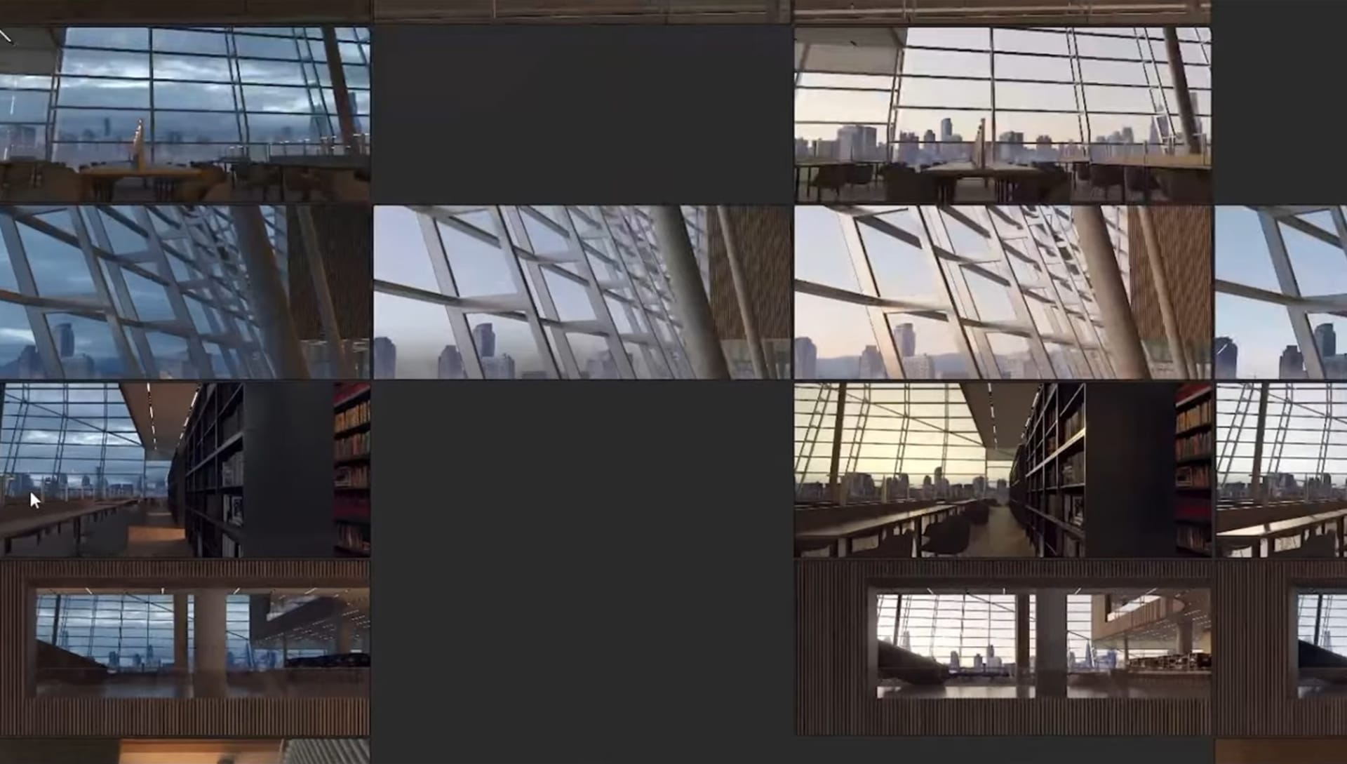
The team spent several hours figuring out the best lighting conditions for each shot. This allowed for a coherent chromatic narrative to be established in the piece. The result isn’t a natural evolution of the time of day but an exploration of lighting and color. It’s important to think of lighting and color like characters in a movie.
Tip 3: Accept the role of director
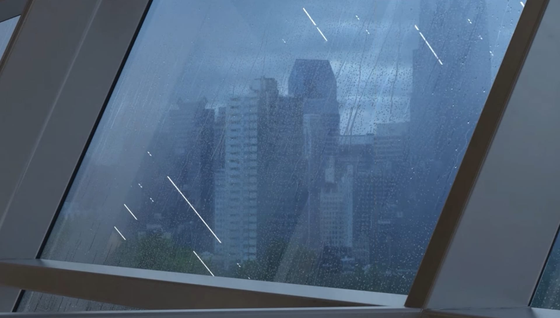
While you move the camera around, it’s important to think as a director and wisely choose the lenses, aspect ratio and the visual language you will use. Remember, the message you communicate will differ a lot based on these choices. In "The Sound of Ink", Beauty and the Bit relied heavily on a cool anamorphic treatment which preserved the filmic look.
Tip 4: Your film is a living organism
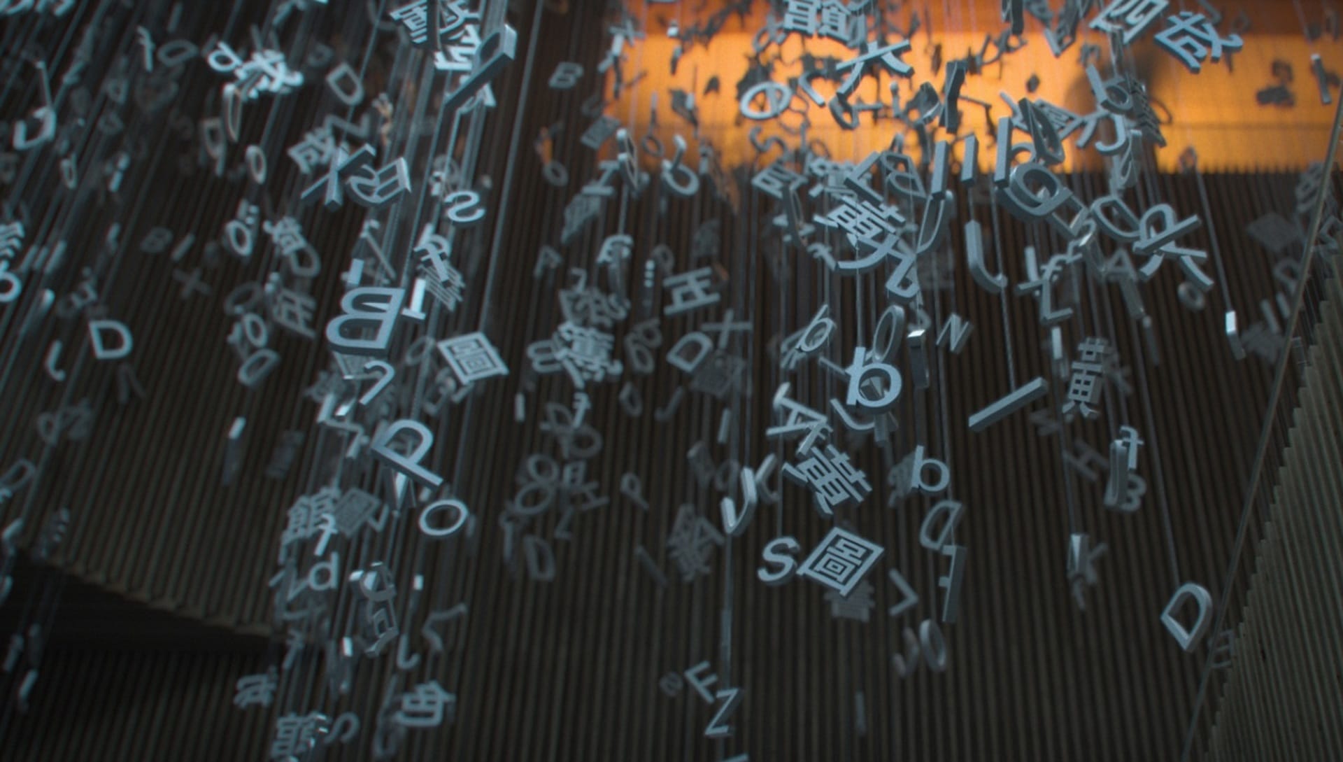
Consider your shots as living entities, and adding layers as a step in developing their character. Always think of the idea you want to communicate and try to encapsulate it in each shot. Layering objects in the shots allowed Beauty and the Bit to add a level of complexity, as seen in the art installation of hanging letters. Be mindful of balancing the composition when adding many elements into the scene, trying your best not to make a mess but rather complementing the feeling of the shots. Once animated, your layers become alive and move naturally in the scene.
Tip 5: Automate your tasks
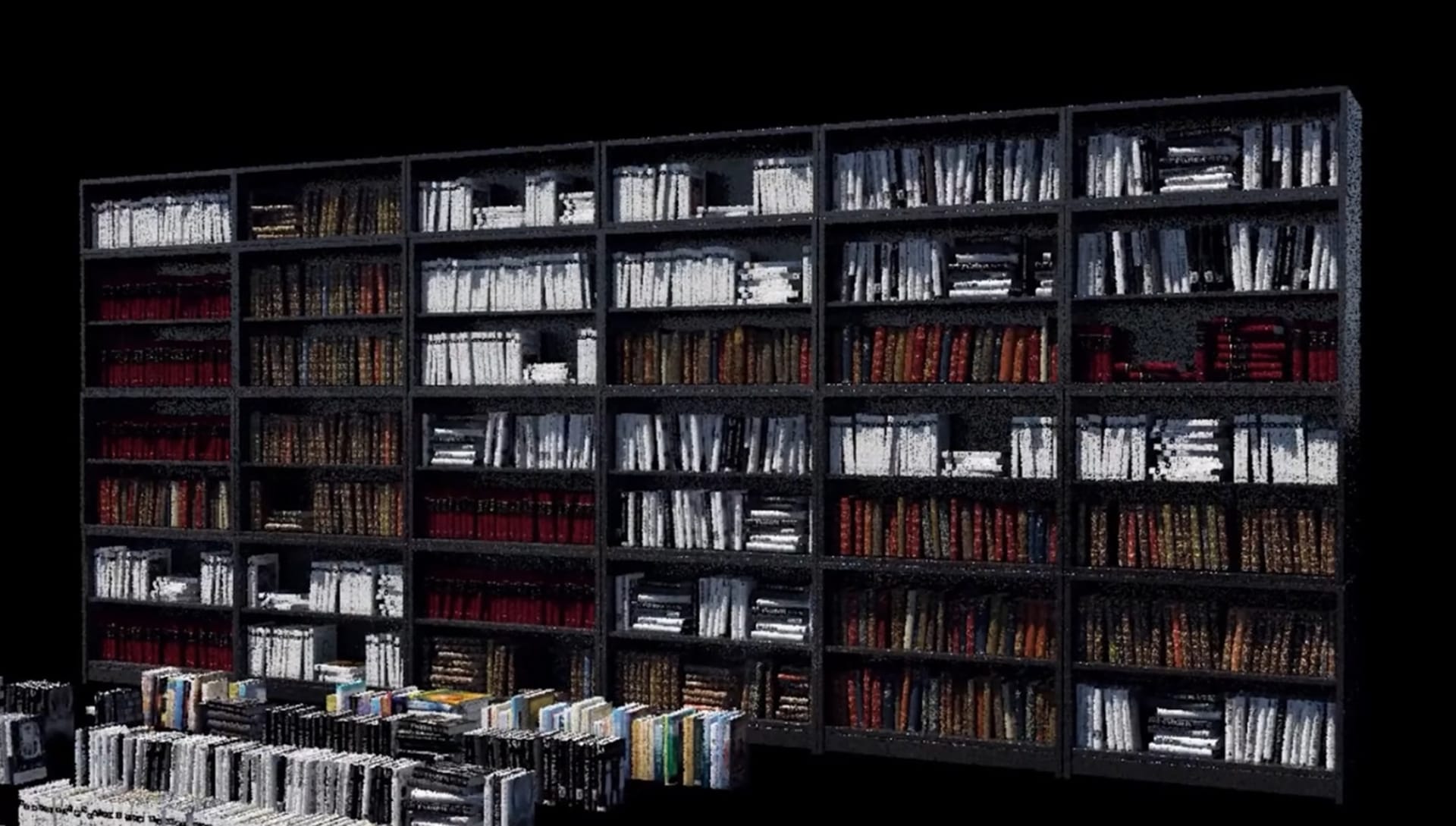
To populate the library’s shelves with books, Beauty and the Bit relied on scripts to automate the task. The assets were randomized and placed on the shelves with minimal effort. In this step, real-time rendering also helps a lot in pre-viz as it allows artists to focus on creating the art and not get distracted by the technology.
Tip 6: Make it believable
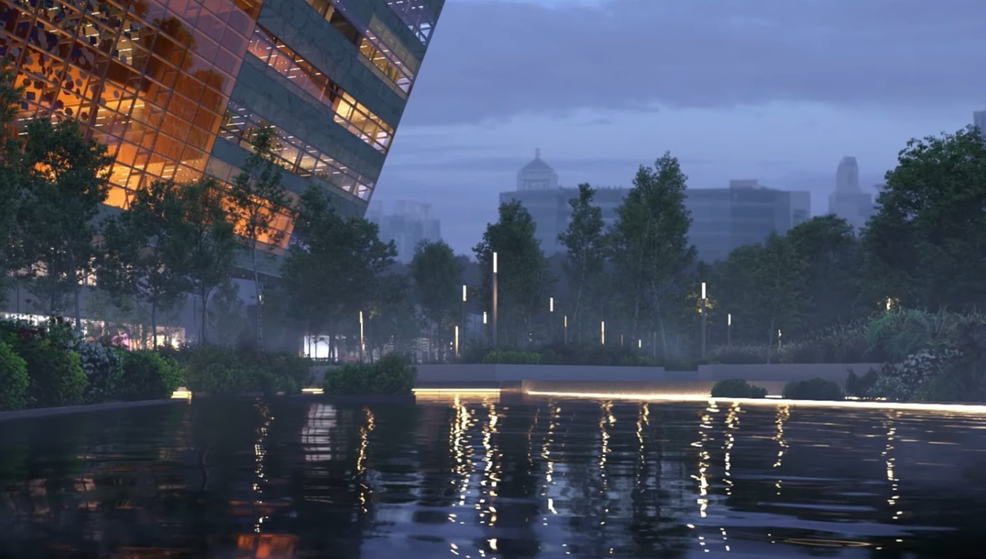
Focusing on getting the assembly of assets just right and adding simulation makes your scenes completely believable. Century Park, the location of the building, is Shanghai’s largest park, which meant adding varied and rich vegetation. Since Shanghai is rather windy from November to May, the wind simulation allowed them to capture that crisp movement. Atmospheric effects were then added to create more attractive shots during the compositing stage.
Tip 7: Perform an advanced multi-pass
After texturing is complete and you enter the composition phase, Victor recommends making an advanced multi-pass. This is a process in which several renderings are made of the same frame, with different camera movements in-between. By performing this step, you will achieve greater versatility in post-production.
Tip 8: Embrace imperfection
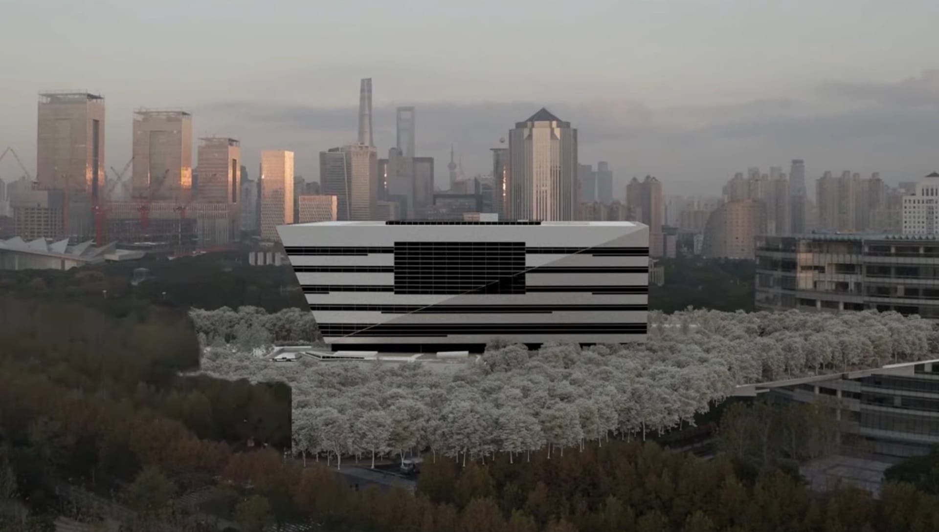
As one of the last steps, Beauty and the Bit created an animated and a regular mask that joins the rendered model with the video. Then, they shuffled all the render passes to have control of each layer. Finally, they added the final post-production filmic looking touches. Drone footage was used for the aerial views. In the end, Victor reminds us to accept the result of the laborious process, and that beauty is found in imperfection.
