What does the future hold for us? DesignMorphine graduate students visualize resilient homes, interstellar stages, and more in their master thesis projects.
Last month we put the spotlight on DesignMorphine and got a better understanding of the academy’s Media lab course. We also got the chance to explore the work of graduate students and their imaginative thesis projects featuring futuristic transportation networks, extracted memories, exosuits, and terrariums.
Craving some more interstellar inspiration? Check out these five thesis projects from DesignMorphine’s Science in Computational and Advanced Design program and learn how V-Ray and Cosmos helped create them.
Please introduce yourself in a couple of sentences.
I’m Anett Kulcsar, an artist and computational designer from the Netherlands. I am fascinated by and draw inspiration from human psychology, art, science, technology, and nature.
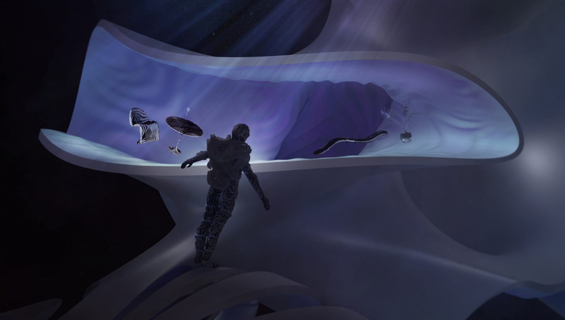
How does form follow function in this piece? Is this a live structure and how does it interact with the objects on and around it?
“Quantum Experience” is designed as a resilient home of the future: a dynamic and fluid habitat of cyborgs with levitation abilities. A home in which imagination leads interior design choices and where spaces can transform according to the needs and wishes of the cyborg. The frequency patterns of the walls and furniture express the consciousness of the inhabitant.
How do you decide on the camera angle for such a complex and intricate render?
The aim was to reflect a sense of spiritual mystery through cinematic composition in which the viewer could get a glimpse of the cyborg arriving home in this metaphysical world.
Please introduce yourself in a couple of sentences.
I’m Pedro Venegas, an architect and computational designer from Peru. I’m obsessed with the idea of discovering and learning to use new digital tools. The idea that all of these fantastic new technologies are just extensions of our creative brains, helping us to understand the world in new and different ways is something very exciting to me.
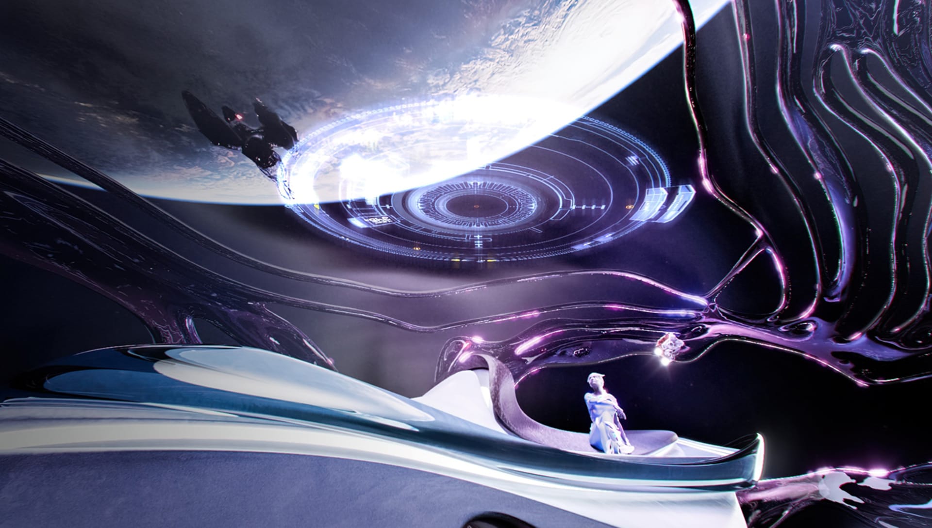
What new techniques or workflow optimizations did you learn when creating this render?
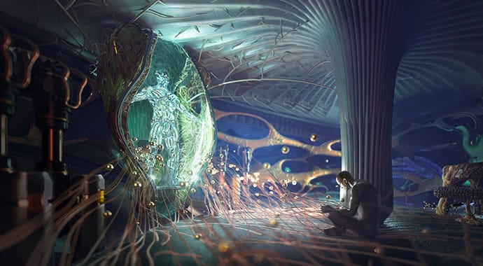
A complex but really interesting workflow was trying to use V-Ray in Grasshopper. The original idea behind this render was to animate a hologram at the top of the translucent cupola. Even though I couldn't render this video, I got fascinated with the idea of working parametrically when creating a render. I’ll definitely invest more time in learning this workflow in the future.
Do you have a favorite V-Ray feature that you always use and that helped you in this scene?
Chaos Cosmos was a big revelation for me when it came to the composition of this render. The fact that I had such an enormous assets library at hand really helped me develop the story behind this scene. I’m extremely impressed with the power of V-Ray, especially how easy it was to create such a cinematic atmosphere.
Please introduce yourself in a couple of sentences.
I am Nadia Kutyreva, 3D footwear and computational designer, based in Portland, Oregon. I am equally fascinated by the world of prehistoric creatures as well as the role of sci-fi in influencing our future.
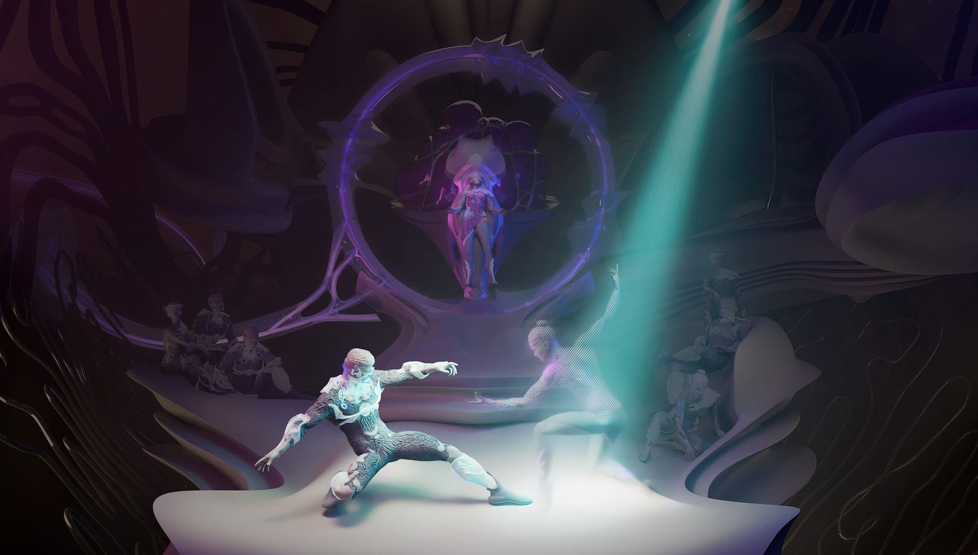
What action is going on in this render?
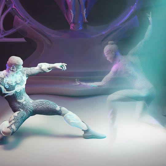
In the future, people will populate not only the solar system but other areas of our galaxy. In my render, I’ve depicted the “Interstellar Ballet” performance, in which a real human dancer performs with a hologram of another dancer, who physically is in another solar system. They interact with each other through augmented technology. So for them and the audience in the back, there is no difference between real and holo-dancers.
The background interior is a part of the recreational area inside the spaceship that is more like a living organism rather than a technological device. The human in the center is the ship’s host, who is broadcasting the performance to an outside audience.
Can you walk us through the process of creating the main character’s skin?
The main challenge was to have a realistic hologram that complements the lighting scheme of the story, but that is definitely otherworldly. Luckily, V-Ray has the ability to render with different channels and render elements. I rendered the main scene with the main character and audience but without the girl, so she doesn’t cast any shadows. I used the same lighting setup to render only her. At a later stage, I composed both renders together, fine-tuning different layers like shadows and colorful lights to achieve the desired effect.
Please introduce yourself in a couple of sentences.
I am Julieta Guillermet, an architect, public artist, and computational designer from Argentina. I am currently based in Puerto Rico and Washington DC. I am genuinely passionate about creating new spatial and holistic experiences and taking them to the next level using the latest technologies.
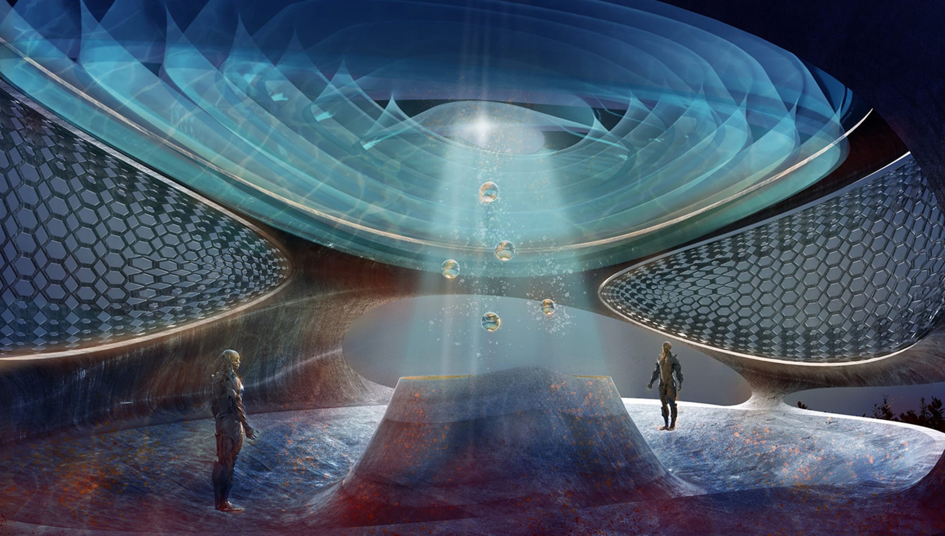
There are a lot of different shapes and forms in this render. How do you decide how to organize them while keeping balance in the render?
Despite the organic shapes of the space structure and its openings, the camera was placed to show the space symmetrically to help balance the render, so the viewer can easily understand the space and its power and how the Neospecie interacts with it. The compositional choices tell a complete story of the space.
The opening to the sides exposes a performative skin pattern. The open frames to one side and in the background allow for showing the extent of the site the building is placed. The upper translucent and bright roof is predominant in the image shown along with and aligned with the heavy concrete base that carries a similar shape-wise gesture. The energy shown between the upper roof and the base marks a vertical accent in the image that also contributes to its balance in terms of general composition and also regarding the light and how the color is used in the image.
What types of colors are you usually drawn to in your work and why do you choose them?
I usually select a specific palette for every project I work on and make sure that it reflects the themes I am exploring. Over time, colors have become the main component of my work, especially for my public art projects. I constantly learn something new about colors from the film and photography industries. I also take inspiration from nature. The palette was closer to the darker blues for this particular image, with some purple and turquoise to brighten up the image. I also added a bit of complementary brown and orange as an accent on the floor. This added further detail to the render and diversified the color palette. This choice was also inspired by how the sky lights up on a stormy night.

